Making Feedback Feel Safe Enough to Give
Customers weren't skipping worker reviews out of indifference. They were skipping them because it took too long, because they could be identified, and because of what a bad review might cost the person it was about.
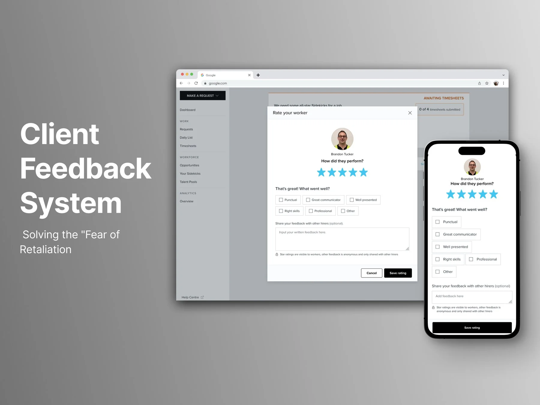
A marketplace running on missing signal
A large volume of Sidekicker's customers simply weren't leaving their workers feedback or ratings. That mattered on three sides at once: worker quality on the platform depended on it, every other customer's ability to make an informed hiring decision depended on real signal rather than silence, and the workers themselves had nothing concrete to improve against — no sense of what they were doing well or where they were losing shifts.
The objective was to increase both usage of and confidence in the rating system — while generating genuinely useful data for the business to maintain worker quality and give other customers something real to hire from.
Silence isn't the same as indifference
The easy read was that customers didn't care enough to rate anyone. Rather than assume, I wrote four hypotheses for why they might not be, and built the survey to test each one rather than to confirm the story we already had.
Privacy — they're concerned about being identified. Worker impact — a negative review might have real consequences for the person it's about. High effort — leaving a review is too much work to be worth it. Learning curve — they simply don't know how.
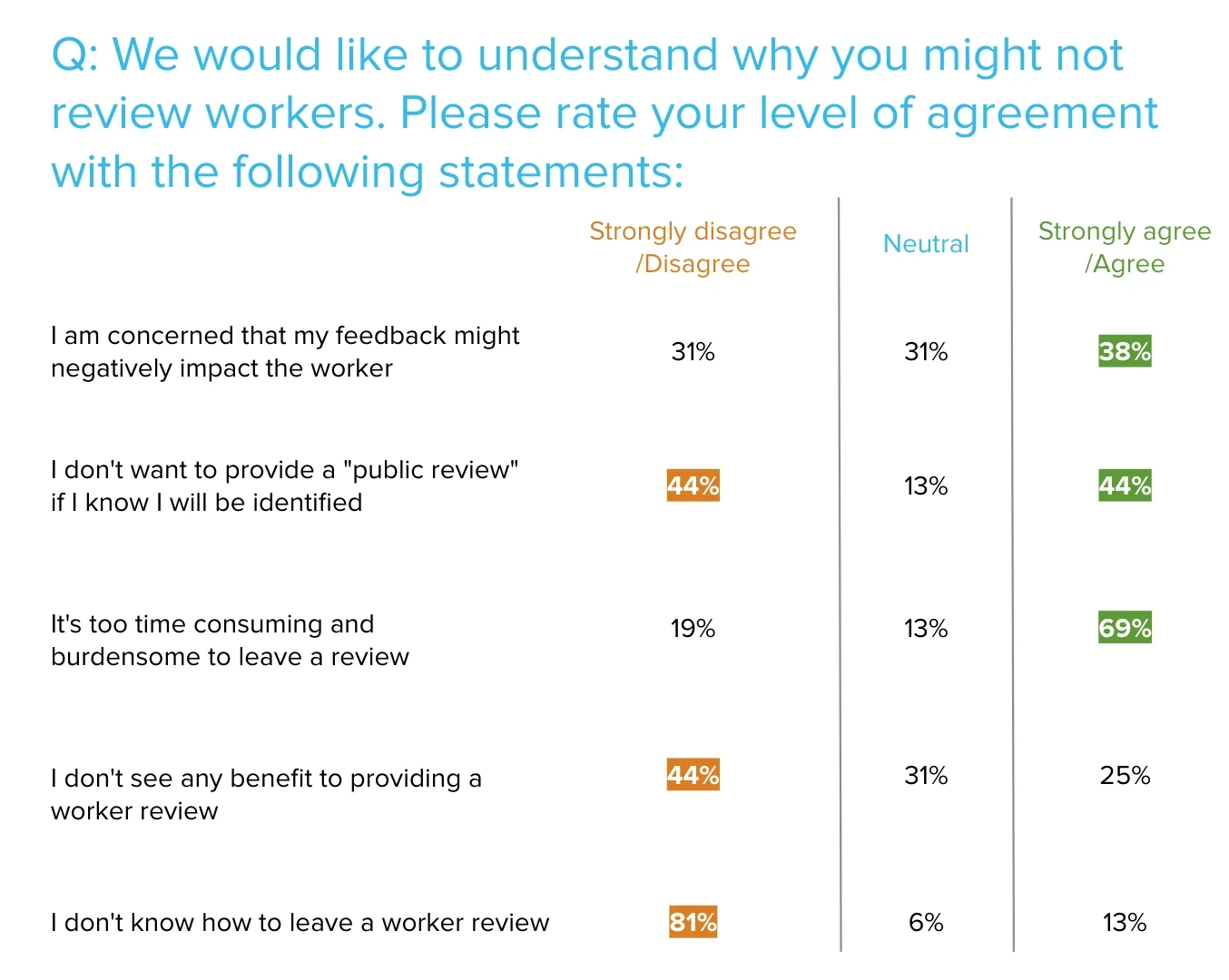
Three of the four held. Effort was the largest by a distance — 69% agreed leaving a review was too time-consuming and burdensome. 44% didn't want to leave a review they could be identified against, and 38% were worried about the effect on the worker.
The fourth was wrong, and it was the useful one. 81% disagreed that they didn't know how to leave a review — so the thing that looks most like a design problem, and is the easiest to build for, wasn't a factor at all. Had we skipped the survey, an onboarding tooltip would have been a very reasonable thing to ship, and it would have solved nothing.
That's what "fear of retaliation" actually meant in practice. Not a vague discomfort — a specific, remembered consequence. Three real reasons for the same silence, each needing its own answer, all showing up as the same empty field.
Designing against three fears at once
Research run on two tracks at once
Surveys ran alongside workshops and internal interviews, deliberately in parallel. Surveys let customers respond in their own time, broadening participation across different customer types — built closely with the customer-side Product Manager, and shaped with input from CommOps, account managers, and support, so the questions were actually asking the right thing.
Workshops and interviews ran on the internal side: account managers who held the closest relationships with customers, brought in specifically because they understood these pain points better than anyone else could secondhand. A product-team workshop ran alongside it, anticipating what those pain points might be and making sure the worker side of the business had a voice in the process too, not just the customer side.
Success was defined upfront, concretely, before any design work started.
Checked how comparable systems had already solved it
Before designing, I ran an analysis of competitor and adjacent rating systems — not to lift a pattern, but to work out which parts of those solutions genuinely worked and which introduced problems of their own. On a feature this deeply embedded across the platform, it was the cheapest available way to avoid rediscovering a known failure mode the hard way.
Deliberately minimal, deliberately focused
The strongest scoping decision in the project was what didn't change. Working closely with the PM and engineering team, with input from the Head of Product, the call was made to keep most of the existing experience intact and focus effort specifically on the Rating Modal. Customers who'd already left feedback before wouldn't have to relearn a new process — the goal was something easy to pick up, not a redesign for its own sake.
An adaptive modal built around the actual fears
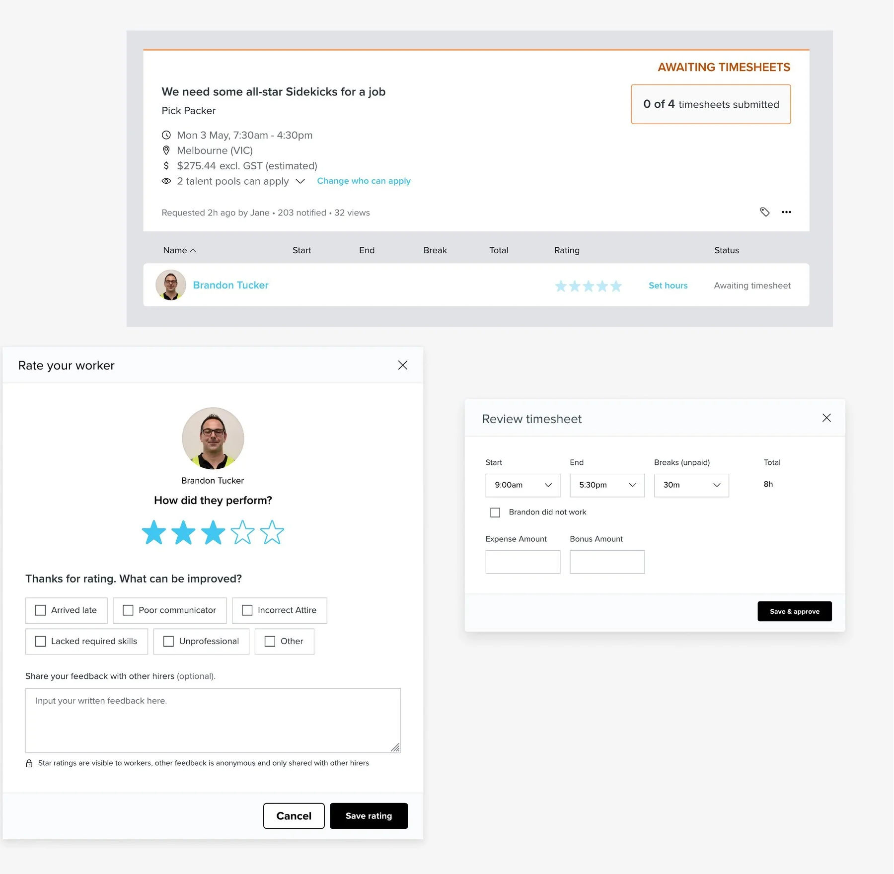
The modal responds to the star rating in three places, not one. The heading turns from "That's great! What went well?" to "We're sorry to hear that. What went wrong?". The answer set switches from qualities to shortcomings. And the free-text label changes from "Share your feedback with other hirers" to "Share details about your experience".
That last one is the piece I'd defend hardest. On a good review, naming the audience is reassuring — you're contributing something useful to other hirers. On a bad one, the same words put the reader in mind of exactly what the survey said stopped them: a critical judgement, attached to them, circulating. So the negative state stops mentioning the audience and asks about their experience instead. Same field, same destination, and the framing no longer works against the thing we were trying to make people comfortable doing.
Free text stayed available throughout, but the pre-canned options meant a time-poor customer could give specific feedback in a couple of taps rather than composing a paragraph — which is what the 69% had actually asked for.
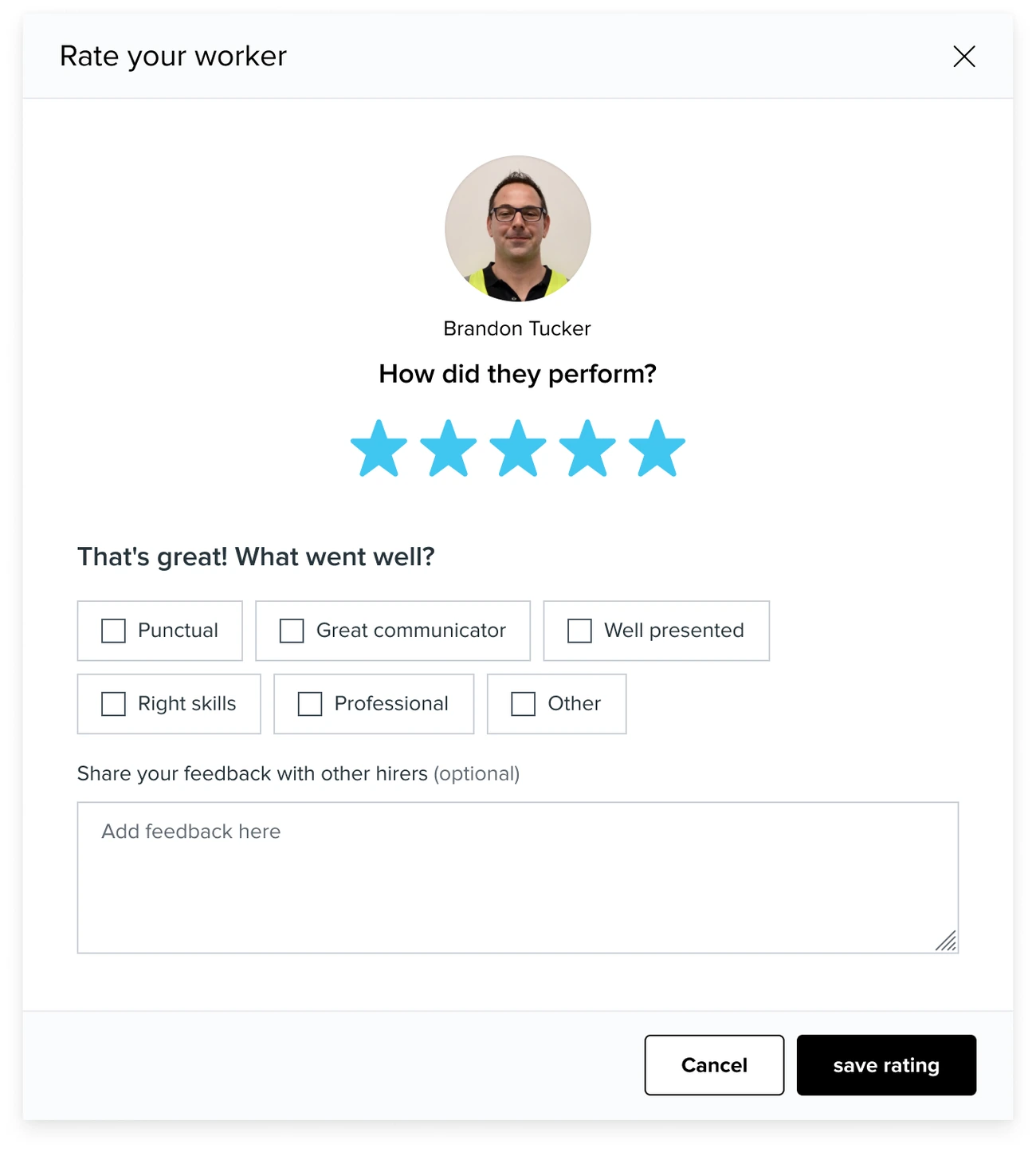
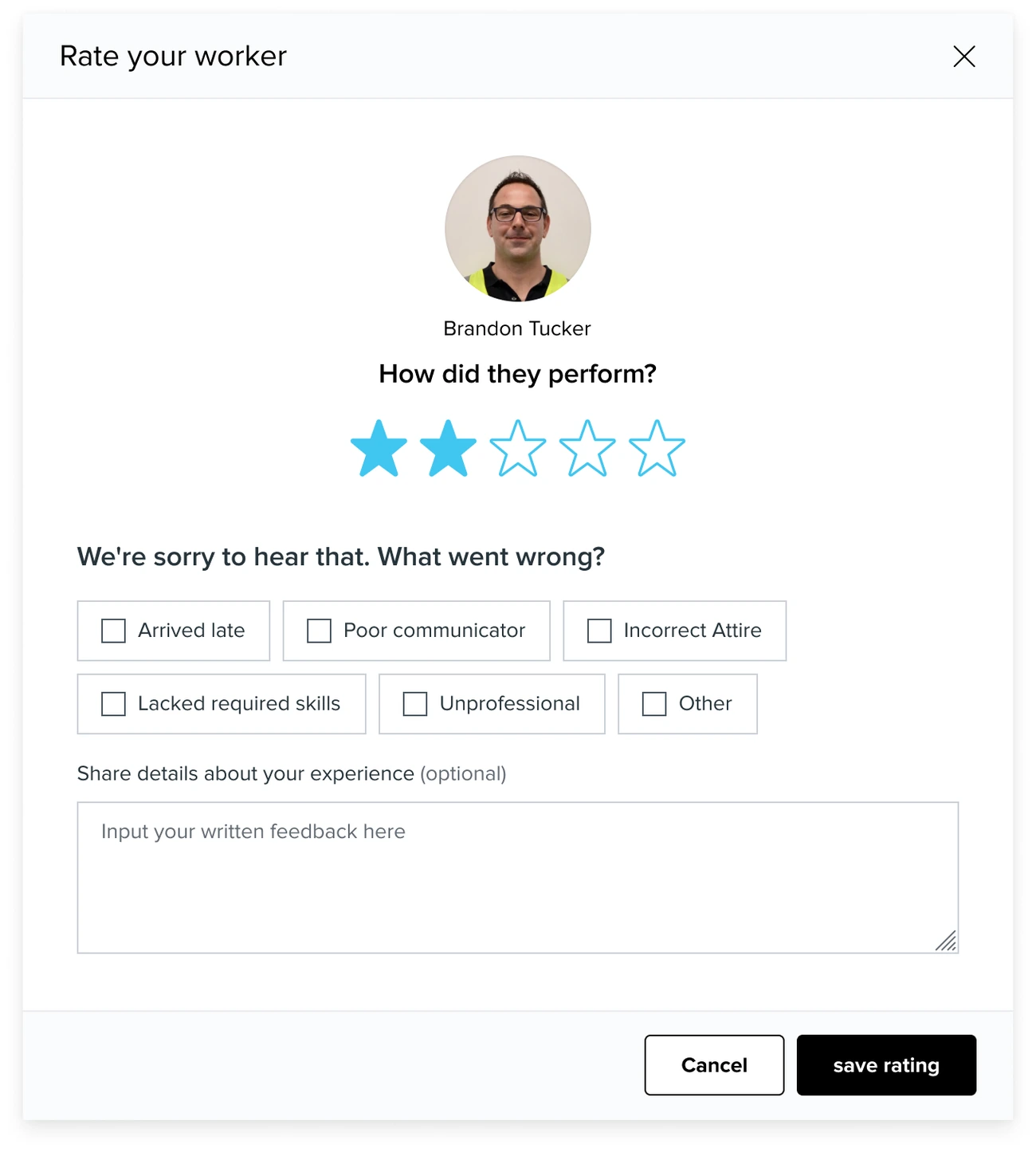
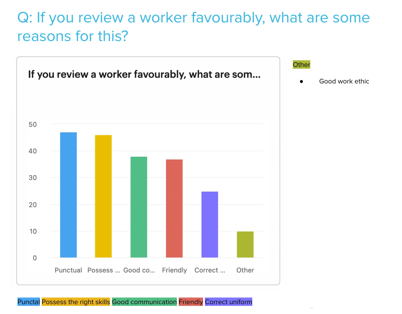
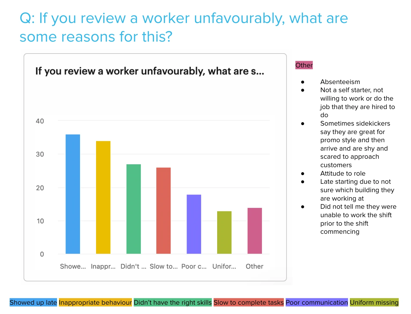
The options drew heavily on the survey rather than a workshop. Alongside the hypothesis questions, we asked clients what actually makes them review someone favourably or unfavourably — offering a candidate list to vote on and inviting them to add anything we'd missed. Those answers, cross-checked against account managers and industry research, are what the final sets were built from. Pre-canned answers only save time if they're close to the words people would have chosen anyway.
What the old flow was actually asking for
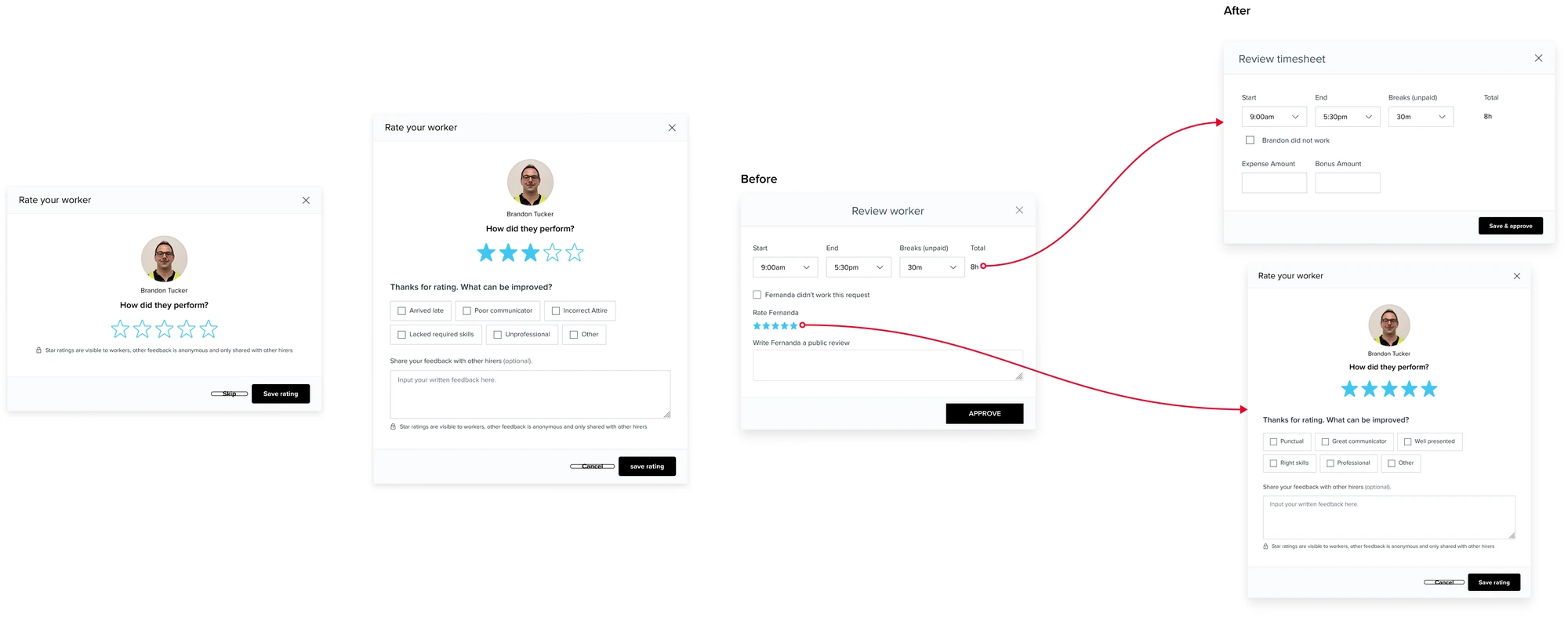
Three details in the existing interface map almost exactly onto the three barriers the survey found, which is the clearest evidence they weren't hypothetical.
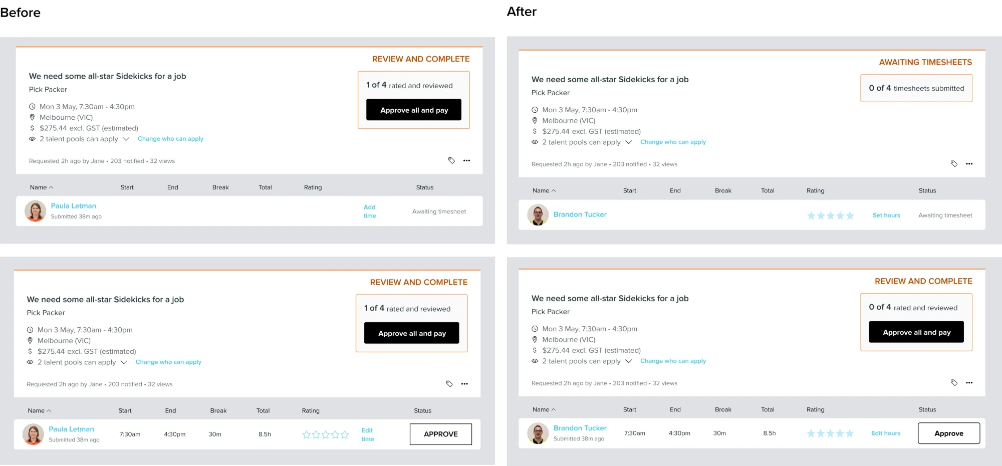
Rating lived inside timesheet approval — one modal, hours and rating together, one Approve button. Someone who opened the platform to do the one task they came for had a review attached to it whether they wanted one or not. The free-text field was labelled "Write Fernanda a public review" — public, and addressed to the worker by name, in a product where a respondent had described a worker retaliating on their company's social media. And the stars came pre-filled at five, so a customer who simply approved a timesheet silently issued a five-star rating they never chose to give.
Effort — the rating separated into its own modal, skippable, with pre-canned answers so a response takes a couple of taps rather than a paragraph. Exposure — the copy changed from "write a public review" to "share your feedback with other hirers," with an explicit line stating exactly what the worker will and won't see. Worker impact — the disclosure model split rather than hid: the star rating reaches the worker so they still get something actionable, while the written detail stays anonymous and hirer-only.
Making a system default look like a system default
The stars needed more care than removing the pre-fill. An unrated worker genuinely does default to five in the system, so hiding that would have been dishonest — but showing solid stars implied a customer had chosen them.
Two changes settled it. Stars now appear on the worker row regardless of timesheet status, where previously they were hidden until the worker submitted their hours and only existed inside the timesheet modal at all. And they render faded rather than solid or outlined — outlined reads as "nothing here yet," solid reads as "someone rated this," and neither was true. Faded says the system has a value and nobody has confirmed it.
The card header changed for the same reason. It had been announcing "review and complete" while the real state was that no timesheets had arrived yet — so the shift list now names the stage it's actually at, and the count underneath it counts the thing that stage is waiting on.
The logic mapped end-to-end before anything got built
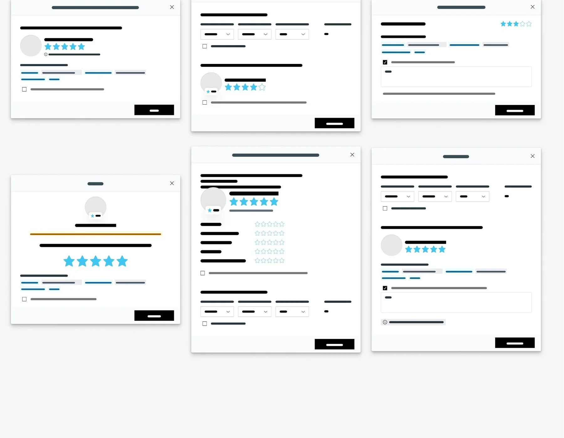
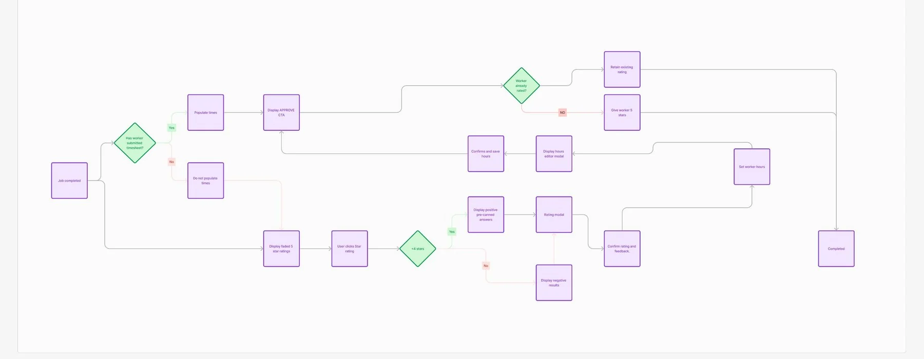
A full user flow was mapped covering every real branch: whether a worker had already submitted a timesheet, whether that worker had already been rated before, how the flow forked at a star-rating threshold into positive versus improvement-focused pre-canned answers, and how an existing rating got returned rather than overwritten.
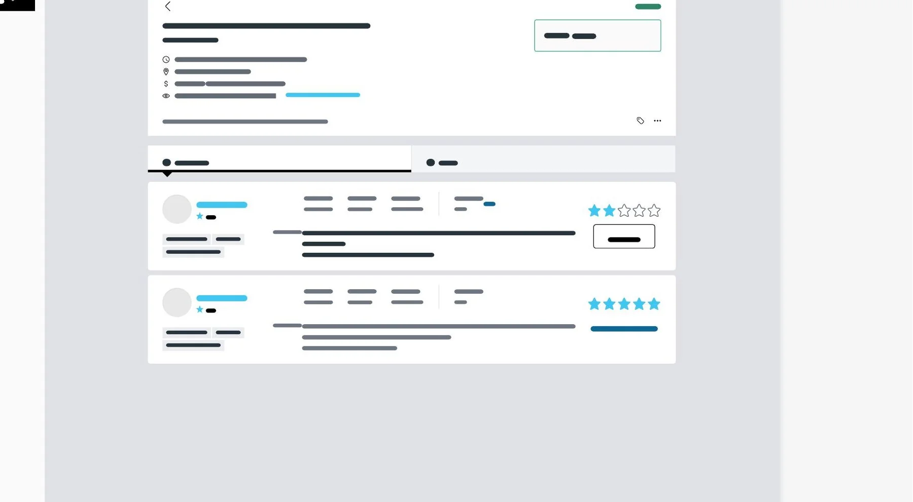
The worker's list within the shift-completion stage was reviewed too, with changes there kept deliberately minimal for the same reason as the modal — consistency over novelty.
What testing could and couldn't tell us
Testing didn't get the breadth it deserved — the timeline didn't allow for it. Instead, the same customers who'd completed the original research survey were sent a second one, this time with a working test version of the new system embedded alongside a questionnaire. Feedback came back positive, with a handful of logic gaps the team had missed — unsurprising given how deeply this feature was injected throughout the platform, touching far more surface area than a typical isolated feature would.
What came back wasn't usage data yet — it was perception. Customers described the new system as more logical and easier to use, and specifically called out liking that rating had been decoupled from timesheets, since it meant they could still get their actual task done without feeling obligated to review anyone.
Well past the target
Within the first month of release, worker reviews being left by customers increased by roughly 620%. New customers opting into the feature for the first time increased by roughly 210%. Both numbers landed well past the original 300% and 100% targets.
That reaction came from the worker side of the business, about a feature built for customers — which was the point. More reviews meant better signal for matching, and eventually something a worker could act on rather than a number handed down without explanation.
Lessons
- The same empty field can have several unrelated causes. Treating low engagement as one problem would have produced one answer — and it would have solved at most a third of it.
- Removing the obligation increased the participation. Decoupling ratings from timesheet approval meant customers could skip it entirely, and more of them chose not to.
- The strongest scoping decision was what didn't change. Holding the surrounding experience steady meant returning customers had nothing to relearn.
- Perception isn't usage. What came back from the second survey was that people found it more logical — encouraging, but not evidence. The real validation only arrived after release.
- Testing breadth was the thing I'd buy back with more time. The logic gaps the second survey caught were a symptom of how much surface area this feature touched, and a broader test would have found them earlier.
The system as shipped was purely customer-driven. The research pointed toward a genuine next step: layering in worker-behaviour signals — attendance, lateness, no-shows — that could adjust a rating algorithmically without a customer having to weigh in every time, closer to how DoorDash handles driver ratings. Done well that cuts both ways, giving workers a criteria-by-criteria view of their own performance and something concrete to act on, rather than a number handed down with no explanation.