Rebuilding the Founder Dashboard
Founders were losing the thread of their own capital raise — and every internal team had built a workaround for the piece of the product that wasn't working for them.
Every team had a theory, and a spreadsheet
Birchal's founder dashboard had grown complicated enough that every internal team had their own theory about what was broken. To understand the actual scale of the problem, I ran 5 stakeholder workshops and 12 one-on-one interviews across three internal teams — Campaign Managers, Sales, and Legal & Compliance — to understand why they believed the dashboard was causing delays.
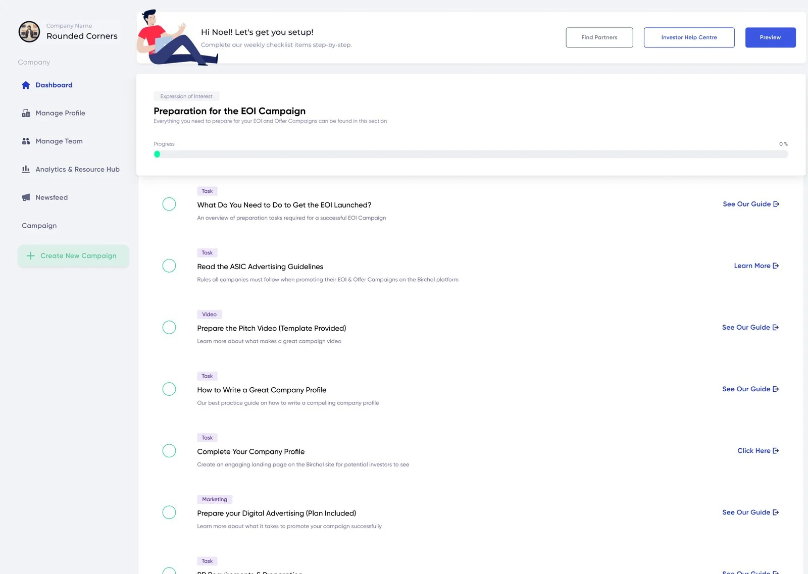
The dashboard wasn't providing clear wayfinding. Founders couldn't work out what to do next on their own, so they leaned on internal teams to get through it — which meant every founder's progress depended on someone else's availability, not the product.
Success was defined plainly from the start: reduce campaign delays by at least 25%, reduce reliance on third-party tools, and reduce reliance on internal teams — steering the product toward being genuinely self-served rather than staff-assisted.
Not lost in the navigation — blocked in the process
Two things came out of the interviews, both said almost verbatim across different teams:
"Campaign managers, sales team and L&C are using 3rd party tools to help track the progress of our founder's progress." Mostly spreadsheets — internal teams had built their own systems outside the product because the tracking features they needed simply weren't there.
"Features required are often using 3rd party plugins or gatekeeped so that only internal teams can use it. I.E. some legal materials can only be uploaded by L&C or Campaign managers." Founders couldn't complete critical steps themselves — the product had locked them behind internal-only permissions, forcing a wait on someone else every time.
That reframed what I was actually solving. The brief arrived as a dashboard redesign, and the instinct in the room was that founders couldn't find things. But nobody was lost in a menu — they were stuck in a process that didn't tell them what came next, and then stopped them acting on it even once they knew. Wayfinding and permissions, not navigation and layout. Every team around the product had quietly built a workaround for one piece of what it should have been doing itself.
The constraint
I couldn't overhaul internal processes to fix this. The solution had to supplement existing workflows, not disrupt them — Campaign Managers, Sales, and L&C all depended on how things currently worked, broken as it was. That meant mapping the full end-to-end journey and deciding what to improve, modify, or remove without breaking what internal teams relied on day to day.
Designing around processes I wasn't allowed to break
Inherited a design system built for a platform that never shipped, and salvaged what still worked
A previous team had built out a new design system for a different rebuild of the platform that never launched — so what I inherited didn't reflect what the current dashboard actually needed to do. Rather than start from nothing or force-fit it, I reused what atoms still held up and built new patterns specifically for the real, current use case.
Looked outside FinTech for the wayfinding pattern
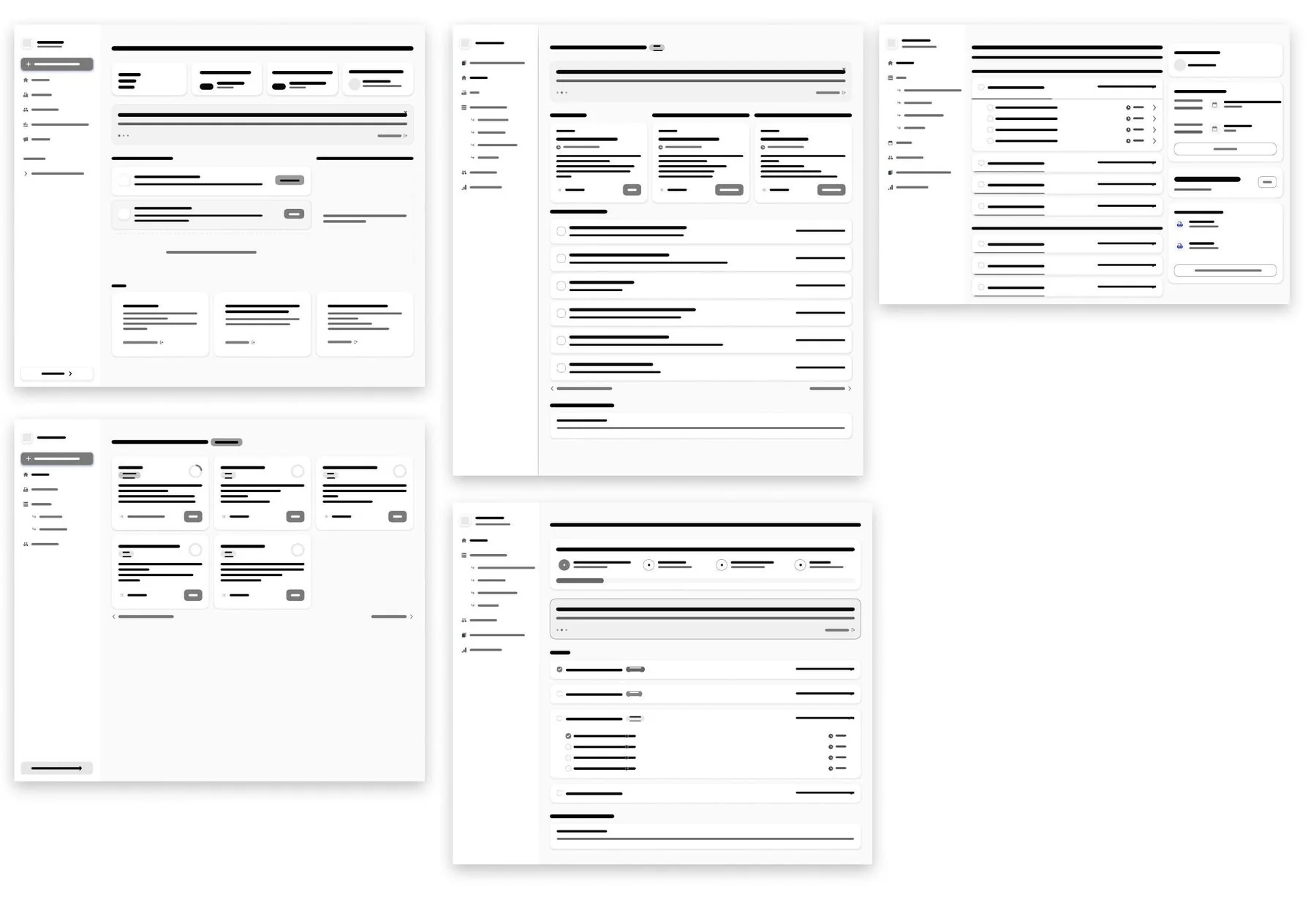
I looked at how project management tools and CRM dashboards handle complex, multi-step processes with multiple people involved — closer to Birchal's actual problem (many stakeholders, one journey) than a typical FinTech dashboard would be.
Of everything in scope, I decided the Overview page mattered most and gave it the most design attention by far. My reasoning at the time: "The overview page is the most vital part of the new dashboard. I needed to make sure the design addresses the issues we've identified but designed it to be easily scaled up when we work on future features." It had to solve the wayfinding problem on its own, and it had to survive every future feature we'd add without needing a redesign.
I built around three things at once: using the new design system to meet WCAG accessibility standards properly, designing a dashboard that didn't force founders down one linear path (campaigns don't all follow the same sequence), and building a roadmap to bring the third-party-tool features back into the product itself, so the workarounds could actually go away.
What the Overview page actually became
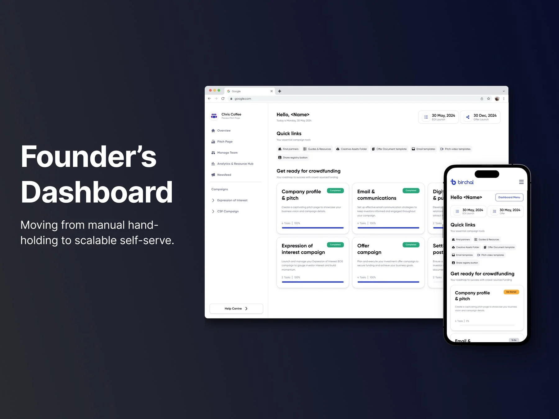
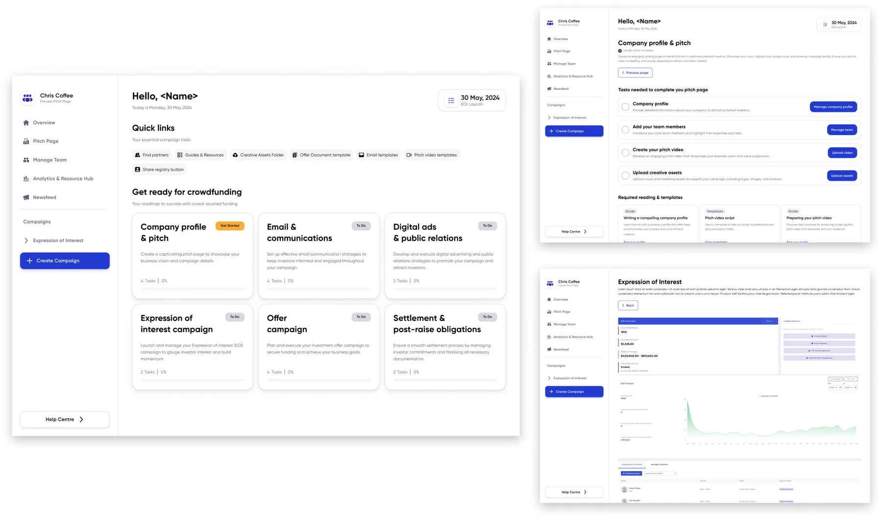
The answer to "what do I do next?" was to stop treating the raise as a task list and start showing it as a staged journey the founder could see all of at once. The page resolved into six named stages — company profile and pitch, email and communications, digital ads and public relations, the Expression of Interest campaign, the Offer campaign, and settlement and post-raise obligations — each carrying its own task count and its own independent status, so a founder could see both where they were and how much was left inside any given stage.
Crucially the stages weren't gated behind one another. A founder mid-way through their pitch page could still see and start email setup, because real campaigns don't run in a straight line, and the old dashboard's linear checklist was part of why people got stuck. Alongside it sat the campaign's actual dates — EOI launch, offer launch — so the roadmap was anchored to the founder's real deadlines rather than an abstract sequence, plus a quick-links block collecting the assets founders had previously been asking Campaign Managers for by email: guides, creative asset folders, offer document and email templates, pitch video templates, the share registry button.
I split delivery into phases so the business wasn't waiting on the whole rebuild to see benefit, and scoped Release 1 deliberately: restructure the information and clean up what was there, before adding any new capability. That mattered most for repeat founders — plenty of Birchal's companies raise more than once, and they'd already learned the existing dashboard. Changing what the product told them without changing how it worked meant the people with the most existing muscle memory had the least to relearn.
The high-fidelity work needed new components and modifications to existing ones, all contributed back into the design system against its established rules and styles rather than built as one-offs for this dashboard.
Building the baseline before measuring against it
I set up an A/B test comparing the new dashboard against the existing one, using Maze. To keep the comparison fair, I rebuilt the existing dashboard to the same visual fidelity as the new design, so participants weren't just favouring whichever one looked more polished — the test needed to measure actual usability improvement, not a paint job.
I deliberately tested against Maze's general population rather than an internal panel — because our actual founders range from highly tech-confident to not at all, and span a wide age range. A narrow internal panel wouldn't have represented that. The plan was originally 30 participants (15 per variant); recruitment realities narrowed it to 14 (7 each) — smaller than intended, but the sampling logic behind it was sound.
Complete at handover, unproven by design
By the time my role at Birchal ended, the work was genuinely complete, not partway:
- Full high-fidelity designs, ready for development
- Documented component variants and interaction states, with micro-animation specs
- Full accessibility annotations and responsive breakpoints
- Comprehensive handover documentation for engineering
- The A/B test fully set up and ready to run
- A complete design system to carry future releases beyond Release 1
The rollout plan itself was deliberately cautious: released behind a feature flag, limited to new founders only. Anyone already mid-campaign would keep the existing dashboard rather than have it change under them mid-process — and the flag meant the whole thing could be disabled and reverted instantly if something went wrong.
I left before the test launched, so I don't know how it performed. I'd rather leave that honestly unresolved than claim an outcome I can't stand behind.
Lessons
- Constraints can be clarifying — being forced to scope down to an MVP, after years of unscoped department voting, was what actually got this moving.
- The stated problem is rarely the actual one. This arrived as "the dashboard is confusing" and turned out to be a process-visibility and permissions problem — a distinction that changed what got designed, not just how it looked.
- When you can't fix everything, decide what has to be right and put your effort there — the Overview page got more attention than anything else because it was the one screen the whole strategy depended on.
- Phased releases reduce risk, but only if each phase is genuinely usable on its own — not just a smaller slice of an unfinished whole.
- Bias-free testing takes deliberate effort — rebuilding the "old" design to the same fidelity as the new one wasn't extra work for its own sake, it was the only way the comparison meant anything.
- A rollout plan is part of the design, not an afterthought — deciding who sees a change and when matters as much as the change itself, especially for people mid-process who didn't ask for something new.