Building Trust Into a Multi-Agency Platform
Clients already trusted Sidekicker with real control over their workforce. The ask was to extend that same trust across agencies Sidekicker didn't own — and in most cases, directly competed with.
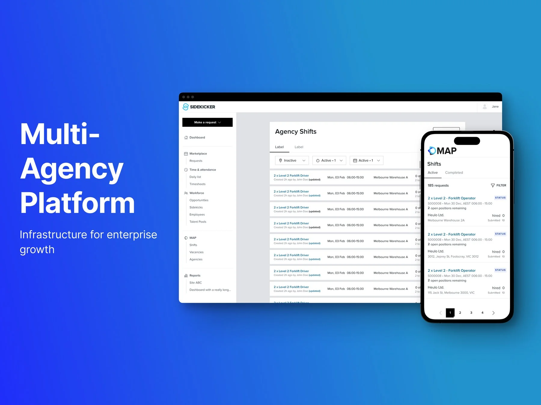
One workforce, managed through a dozen separate processes
Mid to large-scale clients were juggling multiple agency processes at once, and it was costing them in operational inefficiency. Sidekicker's own platform gave them real control over their workforce — but only over the workers Sidekicker itself supplied. Everything else ran manually: a separate request to each agency, back-and-forth largely over phone, and no reliable way to track who was actually turning up, who'd been withdrawn, or whether the people arriving on site were compliant. All of that before the job itself had even started.
The objective: build an MVP by Q4 — a six-month window — that let clients create and manage a job request, and manage workers from their agency pools, in one platform. Success at launch was defined narrowly and concretely: at least three committed customers signed on as early adopters, who would then act as design partners as MAP moved beyond its MVP.
The real issue wasn't functionality — it was association
The instinct was to use Sidekicker's own platform as the blueprint — same control, same transparency, extended to every agency a client worked with. But MAP wasn't a platform clients would use alone. Agencies had to use it too, and agencies knew exactly whose platform they'd be logging into.
Agencies had real concerns about being tied to a direct competitor's product. Winning their participation meant solving a brand-trust problem sitting on top of the product problem, not just building the right features.
Compressing discovery without cutting it
Research grounded in real conversations, not assumptions
Discovery ran through workshops, interviews, and stakeholder input, working to understand client wants, needs, and expectations before touching a single screen. Four findings shaped everything that followed:
A lot of the current processes dealing with different agencies are manual. There is little to no transparency about the workers being submitted by agencies. Communicating across multiple agencies in different channels gets messy and confusing. Managing workers submitted by different agencies is a genuine challenge.
Checked what research already existed before commissioning more
Before sending discovery invitations to clients, I went to the Head of Design to find out whether relevant interviews had already been run. They had — Sidekicker's continuous outreach had already spoken to clients who'd expressed interest in exactly this kind of multi-agency platform. Reusing that work rather than duplicating it bought back time on a fixed Q4 deadline, and meant the new interviews I did run could go after what wasn't already known.
Led a three-day design sprint to buy back the time we didn't have
The timeline didn't allow for a long discovery-to-design handover, so I proposed and facilitated a three-day design sprint to compress the thinking into one room. I ran it as lead facilitator across a group of thirteen — six engineers, three product designers including the Head of Design, two product managers including the Head of Product, an engineering manager, and our QA analyst — structured across three days as define the challenge, define the solution, then prototype.
I also brought in three subject-matter experts from outside the product team: a healthcare SME, our Client Service Director, and a Platform Account Manager. They were there specifically because they dealt with the operational reality of multi-agency staffing daily, and I wanted that in the room while decisions were being made rather than reviewed afterwards.
Using Sidekicker itself as the blueprint — deliberately
Since MAP's target users were Sidekicker's existing client base, the experience needed to feel familiar rather than force a relearning curve. That familiarity came with a real advantage: the pain points and concerns already known from the Sidekicker platform could be fixed in MAP from day one, not rediscovered.
The client-side experience was built inside the Sidekicker platform itself, on new code chosen specifically to support future scalability, following MARI — Sidekicker's design system. I was an active collaborator on MARI as the product designer for the client team, contributing new components built specifically for MAP, including the time picker and updated blank states.
Solving the trust problem with a separate identity, not a disclaimer
The agency-facing side of MAP was deliberately designed differently from the client side. With approval from the business and stakeholders, a new logo was commissioned specifically for the agency platform — visually decoupling it from Sidekicker, even though it still ran on the same MARI foundations underneath. Agencies needed to feel MAP was its own thing, not a Sidekicker extension watching over their business.
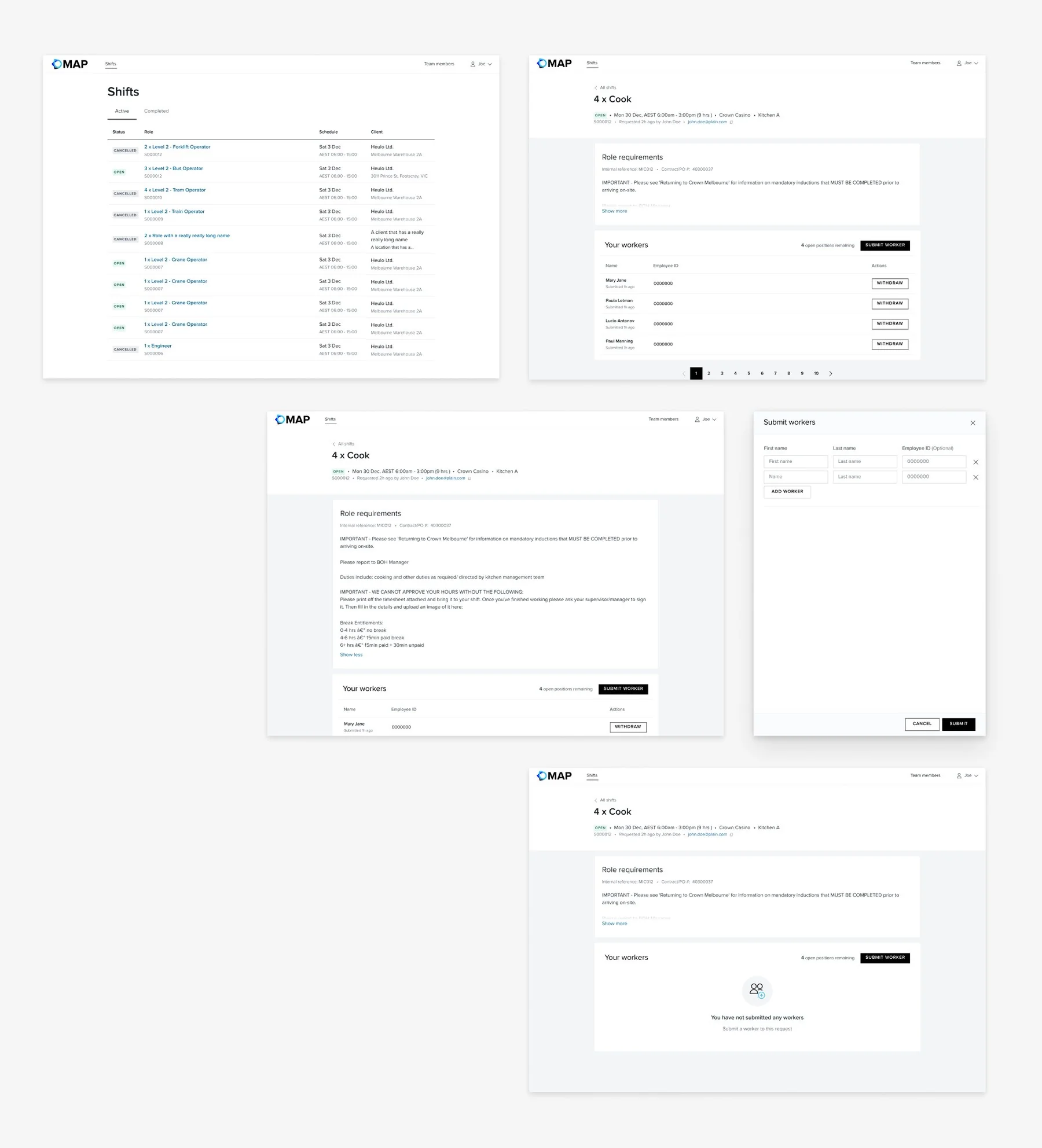
Reworking the core screens with real constraints in mind
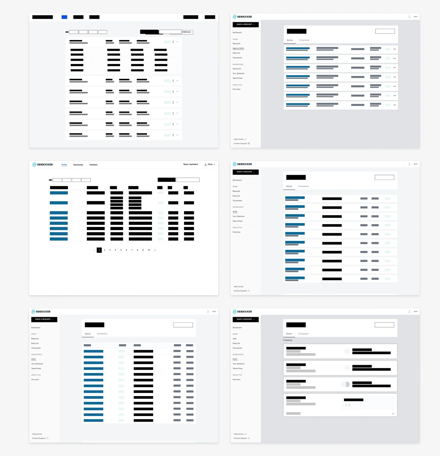
The job feed needed to give clients enough information about a request without adding cognitive load — easy to scan, not a wall of data.
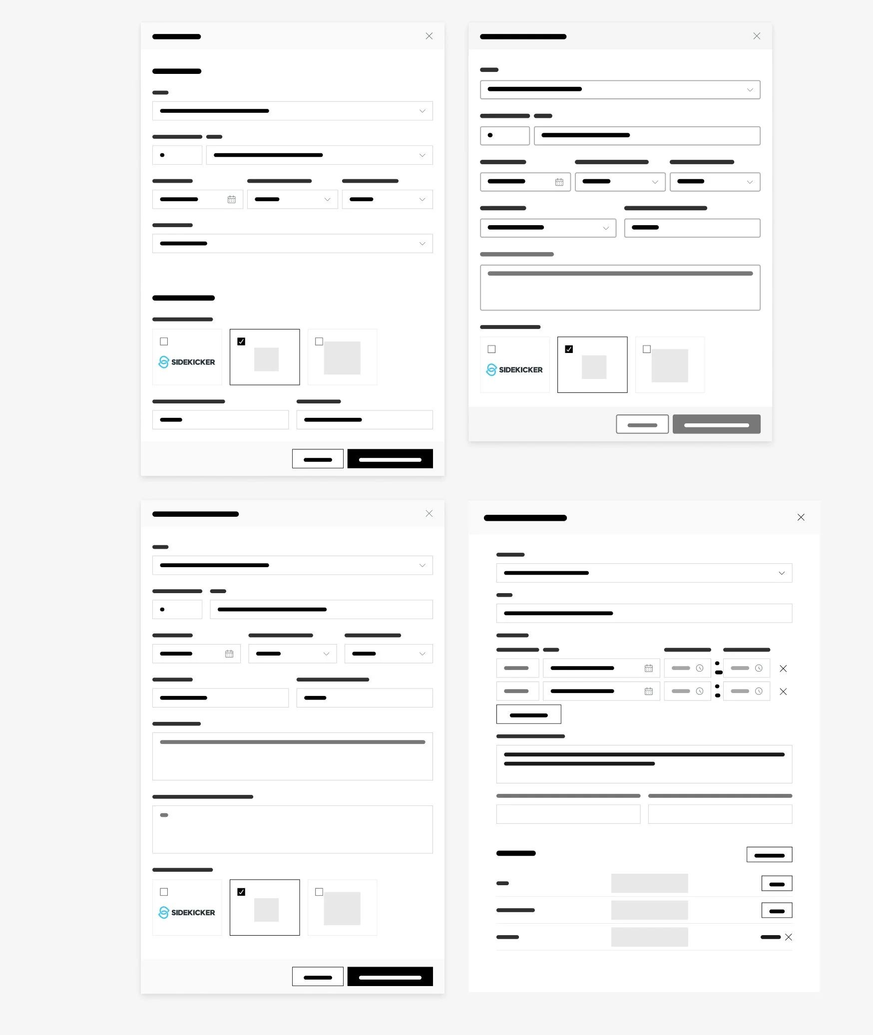
The request form was one of the most consequential screens in the product. Rather than following the full-page pattern competitors used, I designed it as a modal — deliberately minimal, balancing giving clients every field they might need against the risk of overwhelming them. Whether to include a request-cost estimate came up directly here: it was cut, since pricing it properly would have meant asking agencies or clients to disclose commercial terms neither side would likely want to hand over.
The worker list was kept intentionally simple: no worker profiles in the MVP at all — a deliberate scope cut. This is still where the client makes the actual hiring decision, so the list needed to surface exactly the information required for that judgment call, without the extra weight of a full profile system this early.
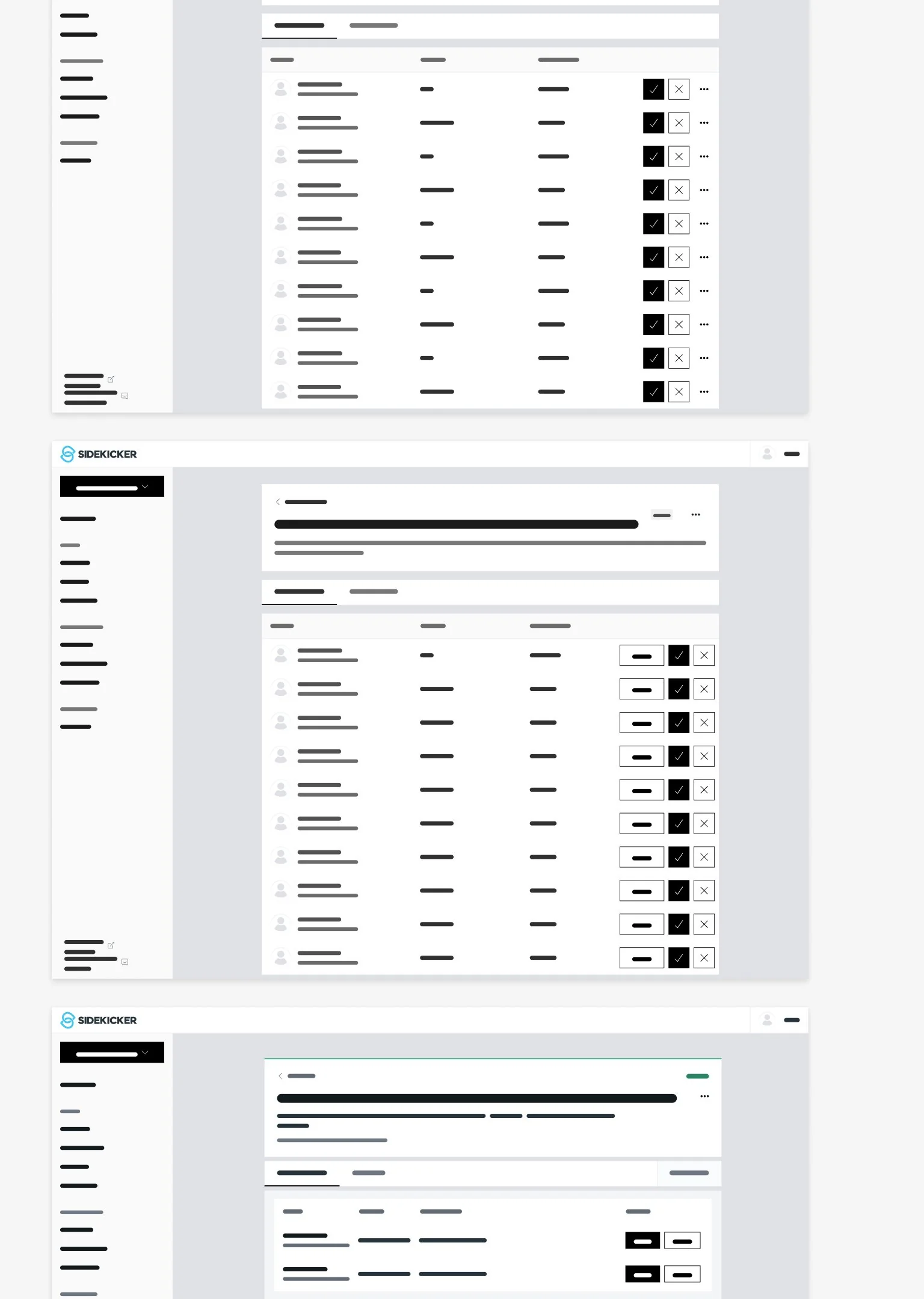
Bulk actions were designed as a genuine quality-of-life feature for high-volume clients that also held up well for lower-volume ones — letting a client manage many submitted workers at once instead of one at a time.
Testing the one decision the team couldn't agree on
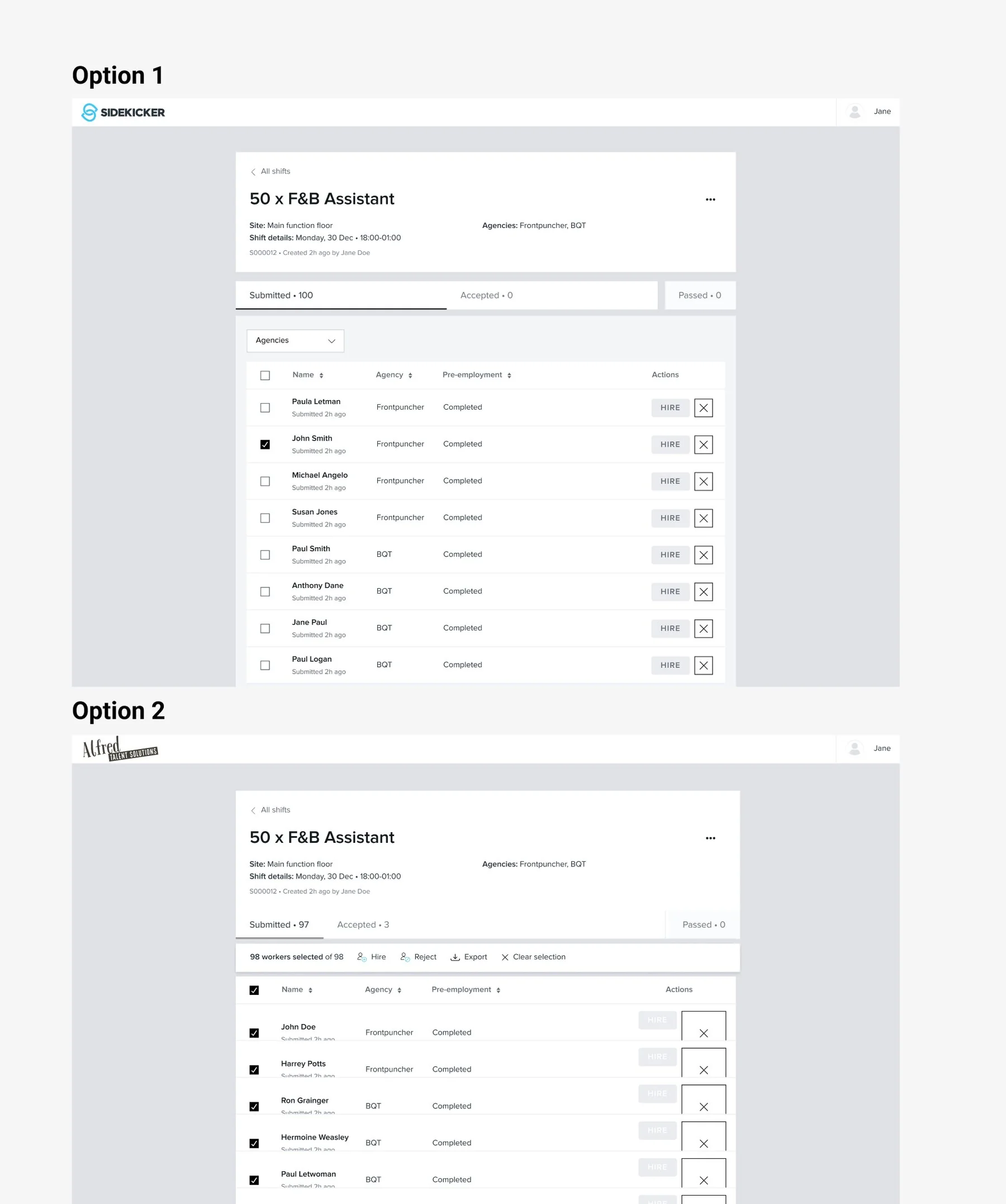
Bulk actions hit a real impasse: two concepts, functionally similar, and no internal agreement on which was right. That's what triggered the Maze test — 30 participants split into two groups of 15, with option order reversed between groups to remove bias. Option 1 used a dropdown-menu pattern, similar to WordPress. Option 2 used a persistent toolbar, closer to Gmail.
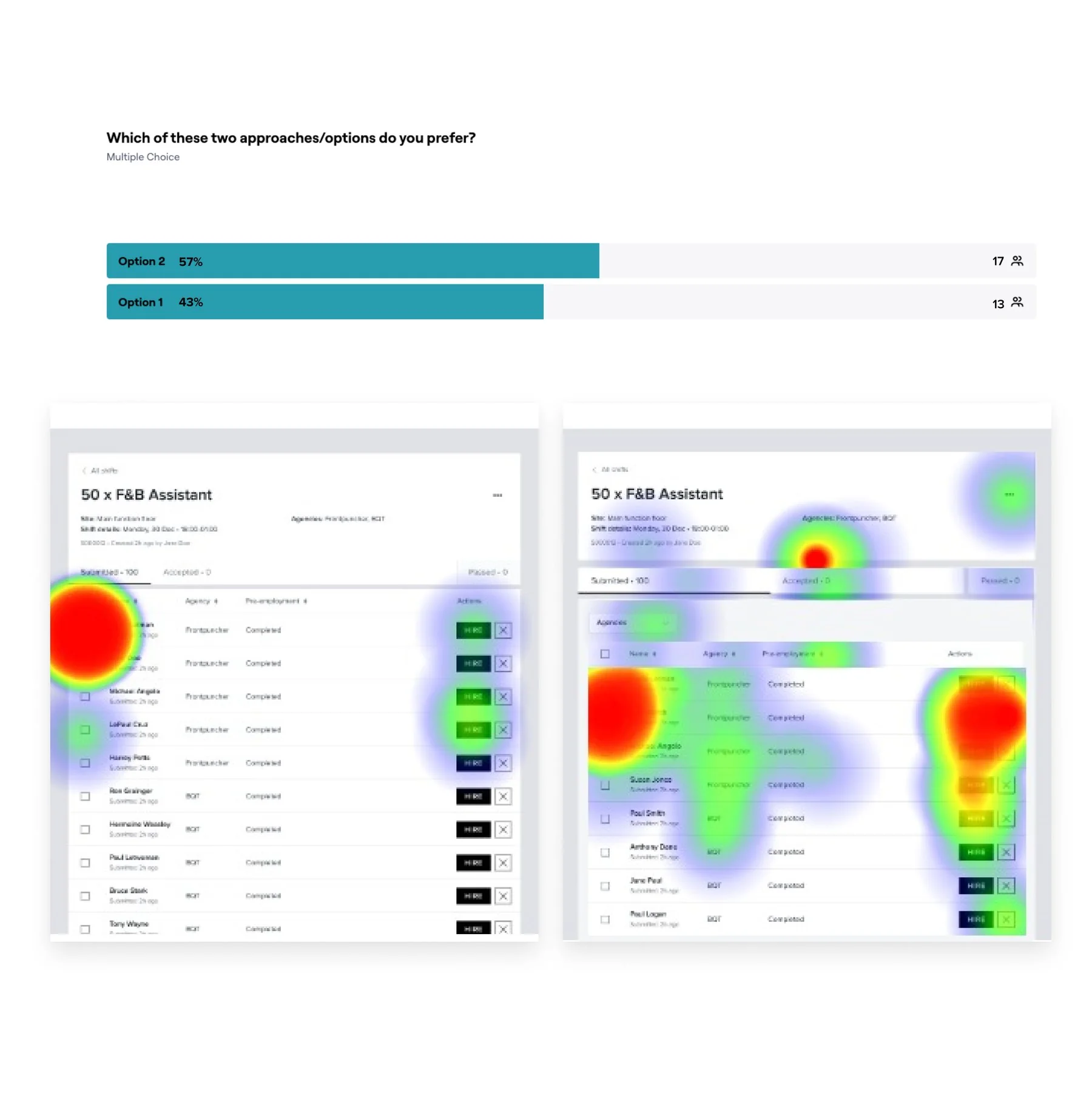
The vote was close — Option 2 preferred by 57% to 43% — but the deeper usability numbers told a clearer story: Option 1 had a ~20% misclick rate and averaged ~20.6 seconds to complete; Option 2 had a ~13% misclick rate and averaged ~8 seconds.
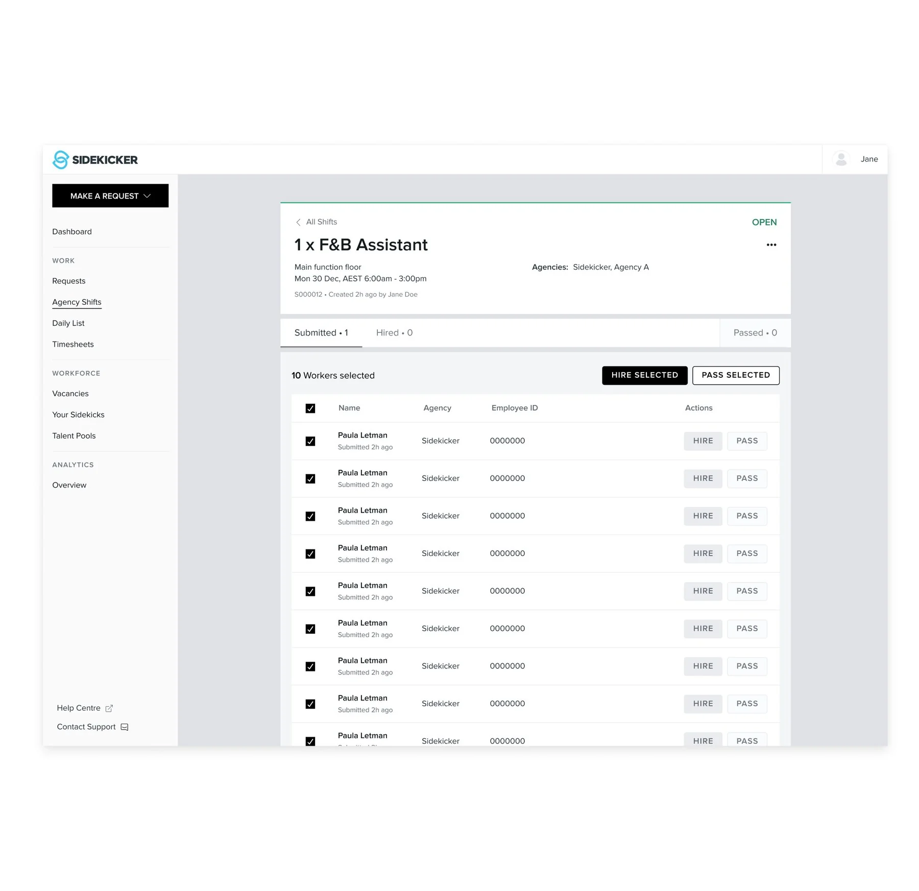
Rather than just picking the numerical winner, I took a hard look at both options and built the final design around the strength of each — a hybrid: a toolbar that was both familiar in functionality and its own distinct pattern, not a straight copy of either test option.
An email system built from someone else's idea
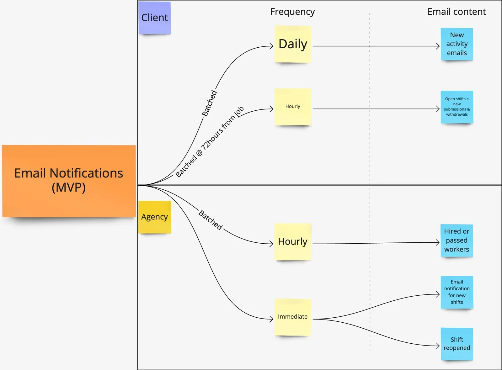
The push to redesign notifications actually started sideways — a colleague was independently exploring email summaries for a different feature, and it was obviously the right shape for MAP's own notification problem. Working with the PM, Head of Design, and engineering, we settled on three frequency buckets — daily, hourly, and immediate — split separately for clients and agencies based on how urgent each type of update actually was, rather than treating every notification the same.
Mobile-first discipline, even for a desktop-first product
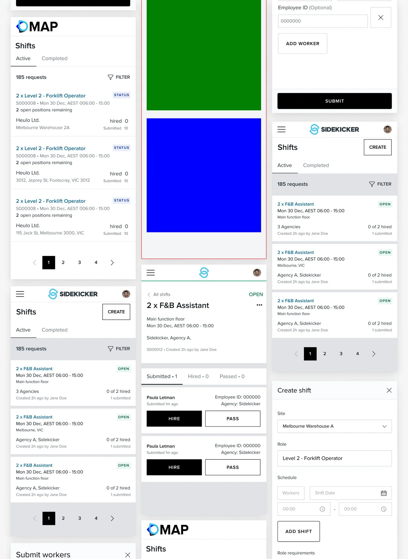
Both MAP and the agency platform were built fully responsive, even though usage on mobile was expected to be small for both sides. Every screen followed the design system's spec precisely — a 12-row, 64px-centre grid on desktop, 4×64 on mobile — with the same level of attention on mobile screens as their desktop counterparts.
Accessibility held to a checklist, not an intention
Sidekicker's client base spans a wide range of technical confidence, and MAP and the agency platform inherited exactly the same spread. MARI was built to WCAG guidelines by default, but defaults only hold if something checks them — so accessibility sat on the QA checklist every design had to clear before it went to engineering, and I verified contrast and colour handling directly using Contrast and Stark rather than assuming the system had covered it.
Demos as the testing ground, by necessity
Client demos doubled as the primary testing ground. For most clients on the list, this was their first real interaction with MAP; for others who'd been waiting on development, it was their first look at what had actually been built. Either way, it meant real-time reactions, direct feedback, and a chance to answer the questions clients actually had — not the ones I assumed they'd have.
The agency experience was validated the same way, out of necessity: clients bring their own trusted agencies with them when they sign up for MAP, so agency and client feedback came in side by side. Agency feedback ran through a more indirect channel — support tickets to account managers, relayed to the product team — a real constraint on how directly that side of the product could be tested.
Delivered — a milestone-based build, engineered in lockstep
MAP shipped across 5 milestones: the first three (plus a 3a) covered the core experience, the last two handled refinement, fixes, and quality-of-life features like bulk actions. Throughout, I stayed in constant contact with engineering — not just at handoff, but through ongoing conversations about platform limits, what was and wasn't feasible, QA sessions, and open brainstorming. Keeping engineers inside the design process, not just downstream of it, was a deliberate way of working.
Measured against a bar of three
The MVP's stated success condition was three committed early adopters. Two months post-release, 3.8% of Sidekicker's client base had opted into trialling MAP, with a 60% client activation rate and 55% agency activation rate. Engagement was tracked through Amplitude and engineering data — how many users activated, how many sites and agencies were connected per client, and critically, how many requests were made and completed, since that was the clearest signal of real usage.
That adoption kept growing: MAP reached 5.3% of Sidekicker's total client base, which at 41,270 clients was roughly 2,200 businesses — against a launch target of three. Client activation rose to 63.8% and agency activation to 59.3%, which was the number that mattered most: it meant the side of the platform with the least reason to trust it was engaging at close to the same rate as the side that had asked for it.
What I'd do differently
- MAP is a smaller platform than Sidekicker itself, but its core problem was every bit as complex. Designing for such a broad and diverse client base — spanning industries with very different needs — meant building a system simple enough for a non-tech-savvy person to pick up and use, without the benefit of detailed personas to design against. I made a deliberate call to skip building them given the timeline, and while I'd stand by that call again, I'd want more time for it if I could get it.
- Agency-side research was the harder gap. Agencies were often hesitant to work directly with us, which meant fewer real chances to test with them and gather feedback compared to the client side. As MAP gathers more traction, the plan was to keep that discovery going — continuing to reach out to both clients and agencies rather than treating research as a phase that ends at launch.