When the Numbers Can't Be Trusted
A legislated funding change put a hard deadline on a financial surface people had already stopped believing. The research kept saying the display was never the problem — so the work became changing what the product measures instead.
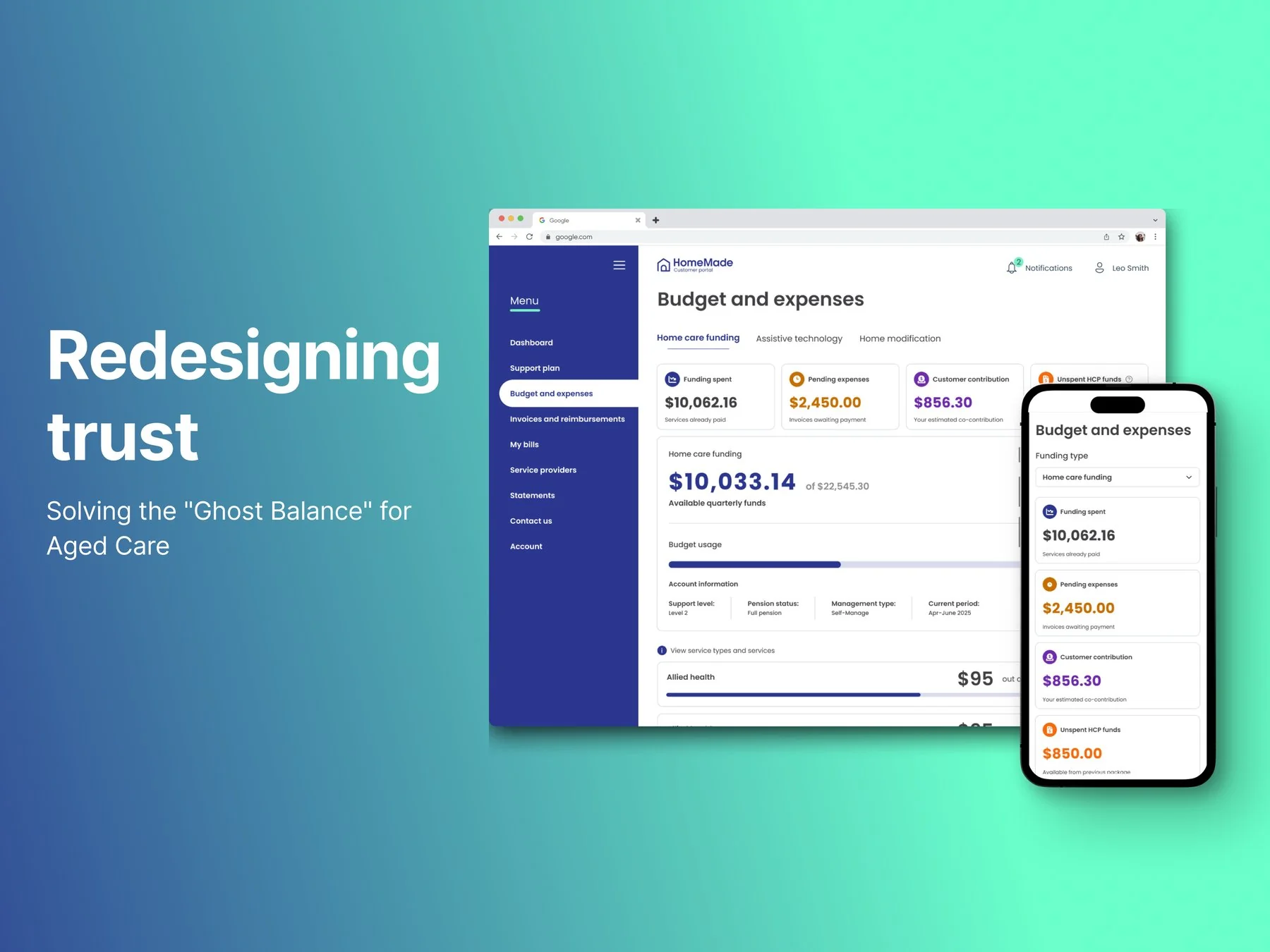
A deadline for a problem that was already there
In 2025 the Australian Government replaced Home Care Package funding with a new model, Support at Home. New funding splits, new compliance rules, and a legislated cutover date. Most HomeMade customers are elderly people or their family carers, and the platform's most-used feature is simple: where's my funding at, and what's left?
The easy story is that the regulation broke that question. It didn't. "Inaccurate balances in statements" was a named sprint focus in September 2024 — more than a year before the new program went live. The clearest evidence was behavioural: customers were reconciling across three separate sources, the Budget & Expenses page, their statement, and the original invoice, to satisfy themselves the figures were right. Nobody cross-checks three documents for a number they believe.
"Improve the Budget & Expenses page — add a financial position summary, and make the data compliant with the new funding model." An artefact to build, with no problem statement and no success criteria attached to it. So the first thing I did was ask for room: I proposed to my design manager and PM that if I could fix underlying pain points along the way, I would. That negotiation is the only reason there was discovery on this project at all.
Both numbers were wrong, so nobody could help
The scale of it was clear from a support-call review and stakeholder interviews before any design work started:
The compounding failure is in the third quote. A customer who can't trust the number picks up the phone — and the person who answers can't help either, because they're looking at a figure that's wrong in its own way. Internal teams had built their own calculators outside the platform to compensate. Both sides of the conversation were doing arithmetic the product should have done for them.
That's what the work was actually for: not a nicer summary card, but reducing failure demand — the calls that only exist because the product failed to answer something the first time. And it couldn't be fixed by designing the page. The platform had no direct integration with the government's payment system, a deliberate pre-launch scoping decision, so claims moved on a periodic manual cycle and a displayed balance could lag a customer's own bank by weeks. Providers can invoice well after delivering a service. The arithmetic chains through many interdependent calculations, deep enough that isolating a failing step became its own investigation.
The first slice: designing for a number that can't be precise
I went through recorded support calls, transcripts and internal staff conversations before designing anything. The reframe came out of that: the question wasn't "how do we lay this page out," it was "what does a customer's budget actually represent, and what makes it change?"
Banking apps were the obvious reference for balances and pending transactions, but the pattern didn't map — a bank balance is a fact, ours wasn't. Borrowing it meant rejecting its underlying assumption first.
Named it "Estimated Available Funds," not "Balance," paired with an expandable breakdown. The number genuinely can't be precise. The honest move was to say so on the face of the interface, and let people check the reasoning themselves. Testing with three customers bore that out — being upfront about the uncertainty built confidence rather than undermining it, and one participant traced a real discrepancy herself, live in the session, without calling support.
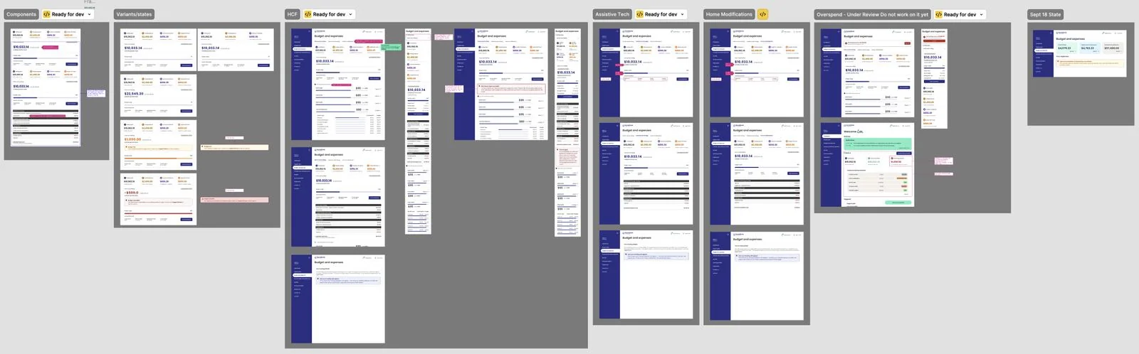
The year spent making the numbers true
The stable period never arrived as planned work. With the remaining funding streams came a harder problem: a legacy pool of unspent funds, shared across streams, with different rules for each. Working with a senior stakeholder I proposed a way to model it — identify from the care plan which services needed paying from that pool, and treat that portion as committed. It was scoped to the two streams it was designed for. Over the Christmas break, it was extended to a third.
The ledger stayed correct, but the interface didn't — and on this surface that matters more than it sounds.
Six months of attempted fixes each moved the error rather than closing it — on this surface, time-to-fix scales with how deeply a calculation is chained rather than with how bad the bug is. When I was told the business wanted to proceed anyway, I said I'd do it, and asked whether the business was willing to carry the risk.
The case for removing it wasn't a principle about foundations, it was the arithmetic: the concept was costing more than it returned. If we wanted to solve this properly we needed something stable to build on, and we didn't have one. I argued to strip it back to calculations that were correct — a position that cost a concept I had co-proposed, and one an SLT member had explicitly held the opposite of. It shipped in July 2026.
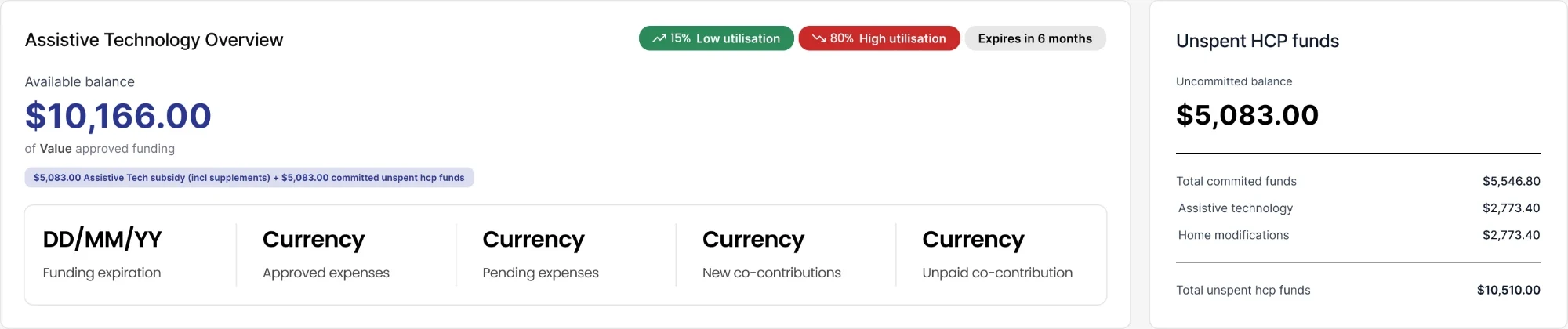
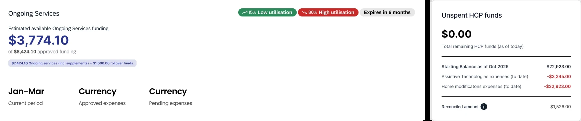
Through all of this the surface changed hands three times. The organisation went from one product team to three, a second squad took the customer portal, and by mid-2026 both of its owners had left. My scope narrowed rather than transferred — I kept the staff platform and the backend the customer portal reads from, and because both render the same data, anything changing on their side had to be mirrored on mine. Having held the whole model longest, I moved from designing to being consulted.
Measuring something we actually control
The research kept returning the same finding from different directions: the display was never the problem. So the question changed — not how do we show this better, but what can we measure honestly. The answer was the customer's own care-plan budget, a number the business sets directly and knows exactly, with no government round-trip.
Support partners deliberately budget a customer to roughly 90% of their available funding, holding 10% back as a designed buffer. Which means the two numbers fail at different times: an overspend against budget is catchable while there's still funding to cover it, where an overspend against funding is already a problem by the time it's visible. That rule was load-bearing for the whole pivot and had never been written down. I documented it in August 2026, having first set the approach — use care plans as the budget source — in September 2025.
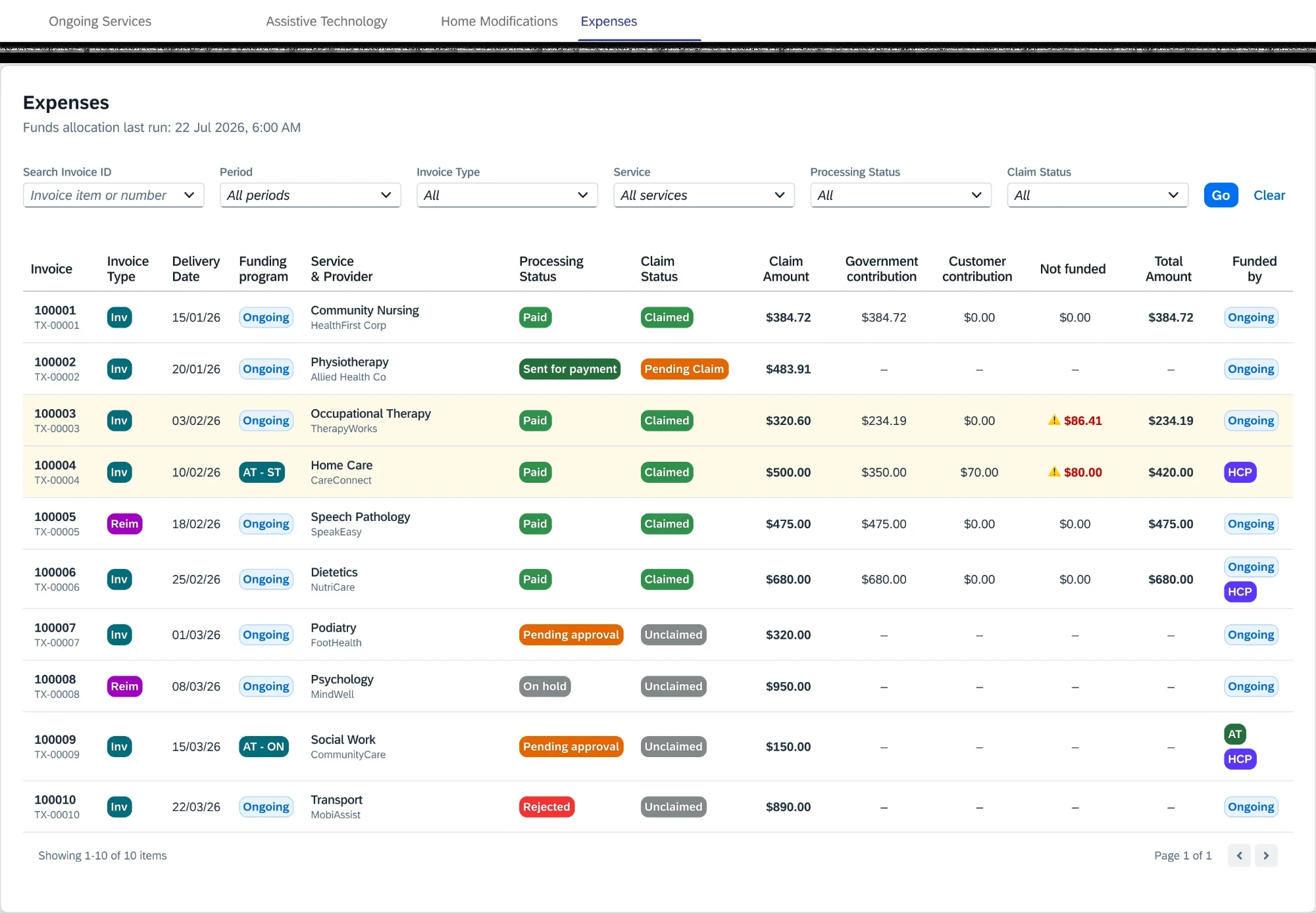
A discovery drawing on eight source types produced seven themes, each carrying an explicit confidence rating, and named two causes as sitting outside design's reach entirely. Saying so changed the scope conversation rather than quietly absorbing both into a design brief. It also surfaced a finding that cut against my own 2025 direction: people didn't want a dashboard, they wanted a ledger. Progressive disclosure is right for comprehension — it is not what people need in order to reconcile. I had treated those as the same need.
When the platform won't let you say it in colour
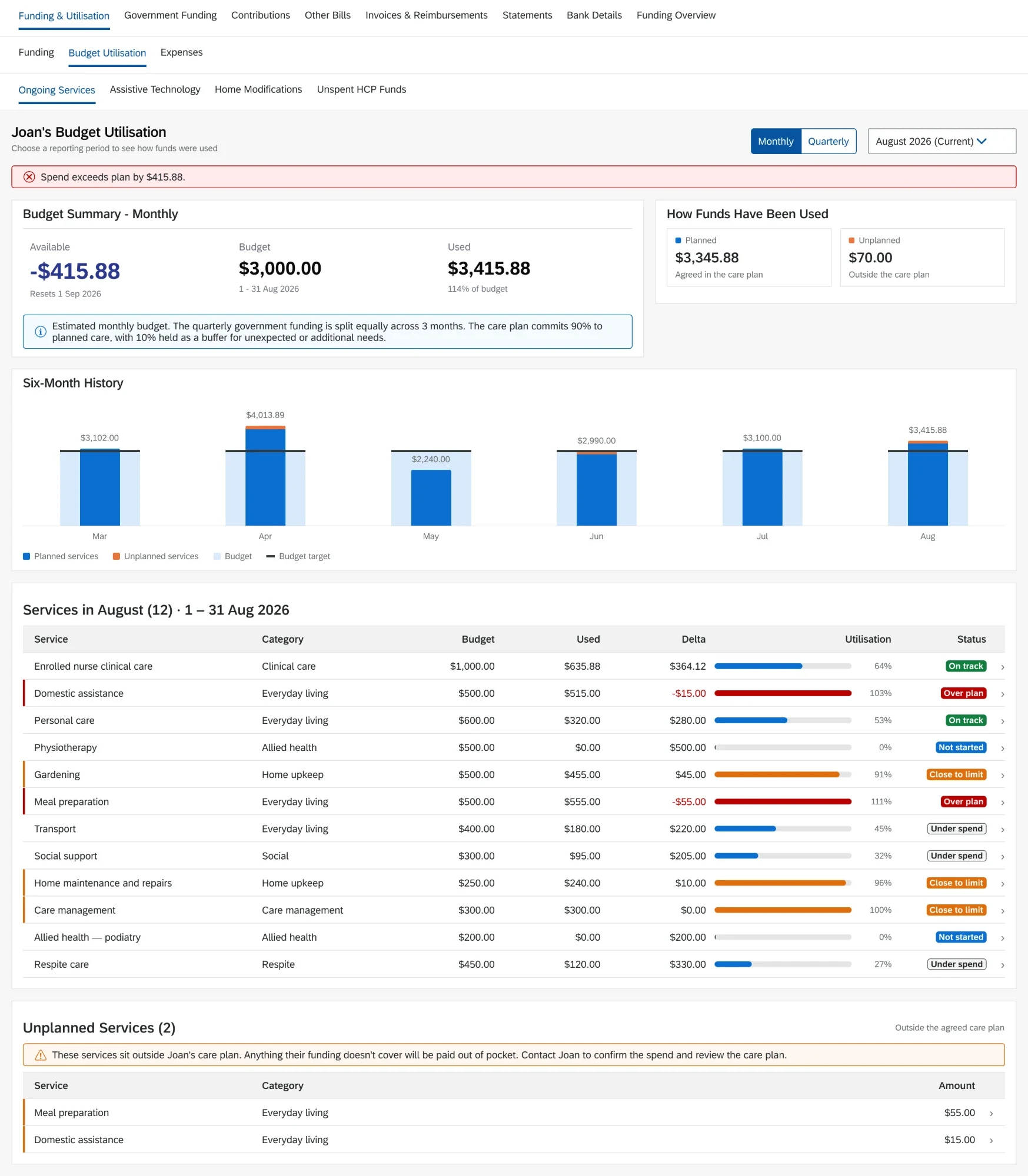
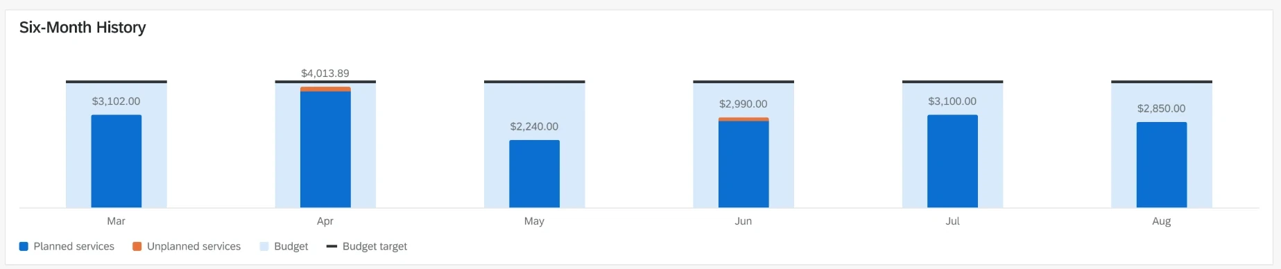
The utilisation chart had one job: make it obvious when someone has gone past their care-plan budget for a period. The intuitive answer is colour — the bar turns red on breach. The staff platform's charting library assigns colour by category, not by value, so it can't respond to what a number actually is.
That had been going round for a fortnight, so rather than keep arguing I ran a feasibility investigation with engineering across the chart types the platform actually offers. We landed on a vertical bullet chart as the best fit and established it could do more than either of us had assumed — a background range showing that period's budget, with the target drawn on it. The compared options set is what settled the debate; not a stronger opinion, a document showing what each option could do.
What didn't hold
An early warning for at-risk balances was tested, validated and shipped — then switched off, for reasons nobody could fully settle a year later. The need didn't disappear; it just went invisible again until the cost of not having it was real.
And the concept I proposed and then argued to remove cost the business roughly six months. I'd defend both decisions — the original reasoning was sound for the streams it was scoped to, and removing it was right once it wasn't — but the honest version is that I helped introduce the problem I later spent half a year arguing to undo.
Lessons
- A borrowed pattern is only useful once you've tested whether its underlying assumption holds. A bank balance is a fact; ours wasn't.
- An idea that's correct within its scope becomes dangerous the moment it's applied outside it — and scope written in a design file isn't a control.
- If the foundation is wrong, a better interface on top produces a better-looking wrong answer. That argument is slower and less popular, and it was still right.
- Comprehension and verification are different jobs. A summary answers "where do I stand"; only an itemised ledger answers "prove this is right."
- Advocacy that stays verbal doesn't survive reprioritisation. Something raised and agreed in conversation needs to become an item somebody owns with a date on it.
Two portals, split by initiative rather than cleanly by side, with one shared backend definition underneath so the numbers can't fork again. The Expenses page is live on both, and the Utilisation work is in build.
Overspend remains a live problem, and that isn't incidental — it's the evidence for the argument this case study rests on. If the foundation had been sound, there would be no overspend problem left to solve. That's also the honest limit of what I can claim: the reframe was right and I'd make the same argument again, but it hasn't finished being proven, because what it depends on is still being fixed on a timeline I don't control.