When the Numbers Can't Be Trusted
A legislated funding change put a hard deadline on a financial surface people had already stopped believing. The research kept saying the display was never the problem — so the work became changing what the product measures instead.
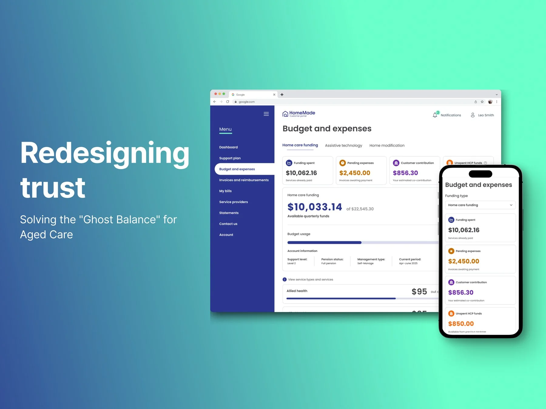
A legislated funding change forced a financial surface nobody trusted — for customers who mostly phone rather than log in. The brief was to improve a page. Eighteen months of research established that the display was never the problem: the numbers underneath it couldn't be trusted, for structural reasons that predated the regulation and couldn't be designed away.
So I argued for changing what the product measures — spend against the care-plan budget, a figure the business sets and knows exactly, instead of against government funding it can't see in real time. That direction now underpins a shipped expenses ledger across both platforms and a utilisation view in build. Getting there meant removing a concept I had proposed myself.
A deadline for a problem that was already there
In 2025 the Australian Government replaced Home Care Package funding with a new model, Support at Home. New funding splits, new compliance rules, and a legislated cutover date. Most HomeMade customers are elderly people or their family carers, and the platform's single most-used feature is simple: where's my funding at, and what's left?
The easy story is that the regulation broke that question. It didn't. "Inaccurate balances in statements" was a named sprint focus in September 2024 — more than a year before the new program went live. I'd been designing the other half of this same financial surface, the customer statements, from that point onward, and a separate invoice-processing discovery I ran in early 2025 had already established the root constraint: claims reach the government through a manual process, so balances lag reality.
The clearest evidence was behavioural. Customers were reconciling across three separate sources — the Budget & Expenses page, their statement, and the original invoice — to satisfy themselves the figures were right. Nobody cross-checks three documents for a number they believe.
"Improve the Budget & Expenses page — add a financial position summary, and make the data compliant with the new funding model." An artefact to build, with no problem statement and no success criteria attached to it.
So the first thing I did was ask for room. I proposed to my design manager and PM that if I could fix underlying pain points along the way, I would — and that I needed to validate three things before designing: whether a summary card was even the right answer, whether it would be enough on its own, and whether it could scale past an MVP. That negotiation is the only reason there was discovery on this project at all.
Both numbers were wrong, so nobody could help
The scale of it was clear from a support-call review and stakeholder interviews before any design work started:
The compounding failure is in the third quote. A customer who can't trust the number picks up the phone — and the person who answers can't help either, because they're looking at a figure that's wrong in its own way. Internal teams had built their own calculators outside the platform to compensate, and answering a single funding question meant manually reconciling across tools. Both sides of the conversation were doing arithmetic the product should have done for them.
That's what the work was actually for. Not a nicer summary card — reducing failure demand: the calls that only exist because the product failed to answer something the first time.
Why it couldn't be fixed by designing the page
The platform had no direct integration with the government's payment system at the time — and that was a deliberate pre-launch scoping decision, not an oversight. Reimbursement claims therefore moved on a periodic manual cycle rather than continuously, so a displayed balance could lag what a customer would see in their own bank account by some weeks. Providers can also invoice well after a service is delivered, which makes any displayed balance provisional regardless of how correct the arithmetic behind it is.
And the arithmetic chains through many interdependent calculations across both platforms, deep enough that when a total came out wrong, isolating the failing step became its own investigation. Behind the single figure a customer reads sit more than a dozen distinct concepts: government funding, their care-plan budget, service allocations, fees, contributions, expenditure, transactions, reimbursements, bills, goal budgets, funding periods, carryover, and the difference between allocated, spent and remaining. One number, carrying all of that.
- The design library couldn't be trusted. I went into production myself to work out what actually existed.
- Learning the domain while designing it. A mid-project policy change caused a real misalignment between the interface and the statements, which we had to catch and resolve.
- No time to test. Not on this project specifically — that was how the team operated throughout. Worth naming, because it explains what happened later.
The first slice: designing for a number that can't be precise
Grounded it in what actually wasn't working
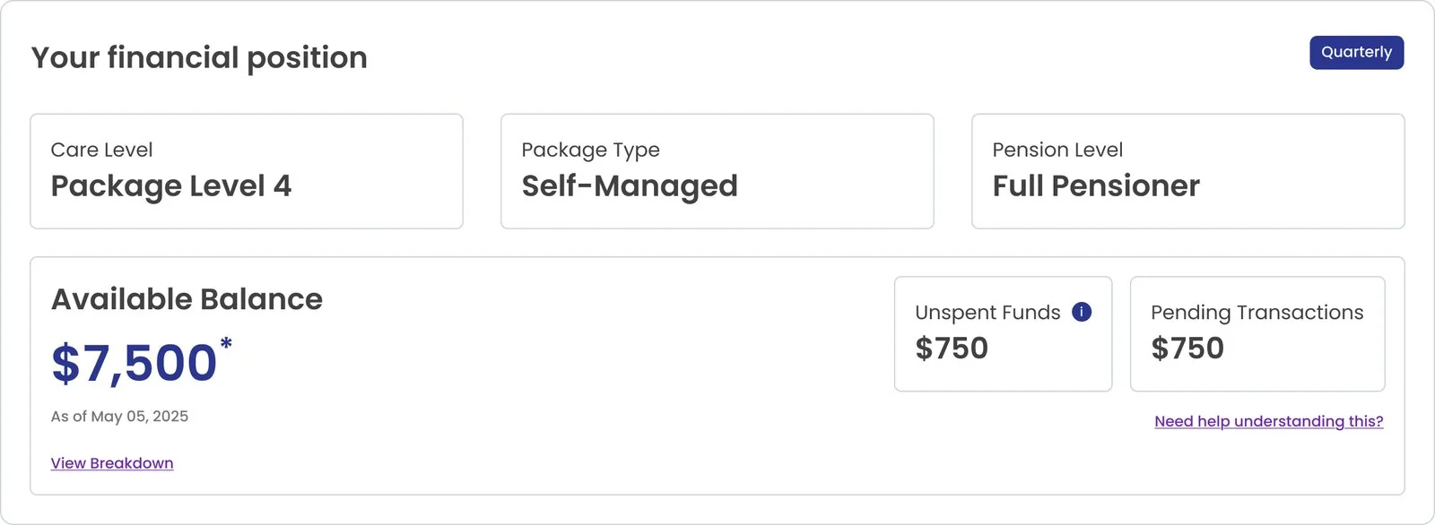
Went through recorded support calls, transcripts, and internal staff conversations from the old funding system before designing anything. The reframe came out of that: the question wasn't "how do we lay this page out," it was "what does a customer's budget actually represent, what does available balance mean, and what makes it change?"

Looked outside the category, then rejected half of what I found
Looked at how banking apps handle balances and pending transactions. The pattern didn't map cleanly — a bank balance is a fact, ours isn't. Borrowing it meant rejecting its underlying assumption first.
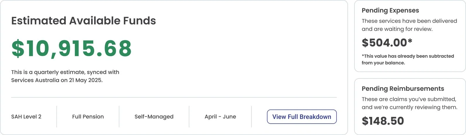
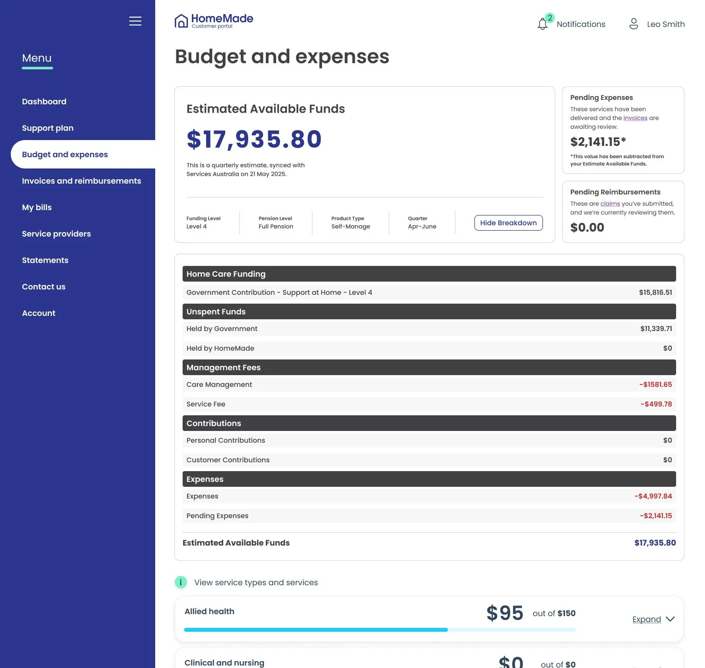
Named it "Estimated Available Funds," not "Balance," paired with an expandable breakdown. The number genuinely can't be precise. The honest move was to say so on the face of the interface, and let people check the reasoning themselves.
Set the order the page should think in
Discovery produced a structural answer as well as a copy one. Rather than presenting everything at one level, the page moves through four: where am I now, how did I get here, what's happening next, and what can I investigate. Summary before explanation, explanation before detail — so someone can understand their position without being walked through the whole financial model, and still reach a single transaction if they want it.
Six principles came out of the same work. Two of them did most of the load: lead with the customer's financial position, and separate customer and operational needs while keeping one source of truth underneath. The second is the one that later hardened into architecture — written as a product principle in mid-2025, and independently arrived at a year later as an engineering decision, with the calculations sitting behind a shared backend definition that both platforms render verbatim so the numbers can't fork. The principle preceded the architecture that enforced it by about a year, which is the best evidence I have that it was right.
Tested it, and the uncertainty is what earned the trust
Tested directly with three existing customers alongside earlier staff validation. The headline finding was that being upfront about the number's uncertainty built confidence rather than undermining it.
One participant independently caught and resolved a real discrepancy, live in the session — using the breakdown to trace a gap of several thousand dollars herself, without calling support. That is failure demand not happening.
Two of three, unprompted, flagged the breakdown text as too small — a concrete accessibility gap, and the origin of a principle I still use: if it has to be read aloud to be understood, it isn't accessible enough.
A participant raised a self-service gap outside what I was testing for — reallocating funds between categories herself.
Shipped, covering one funding stream, knowingly incomplete
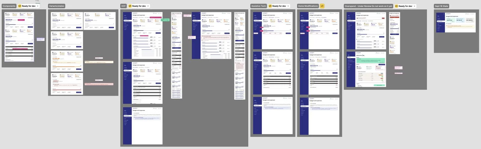
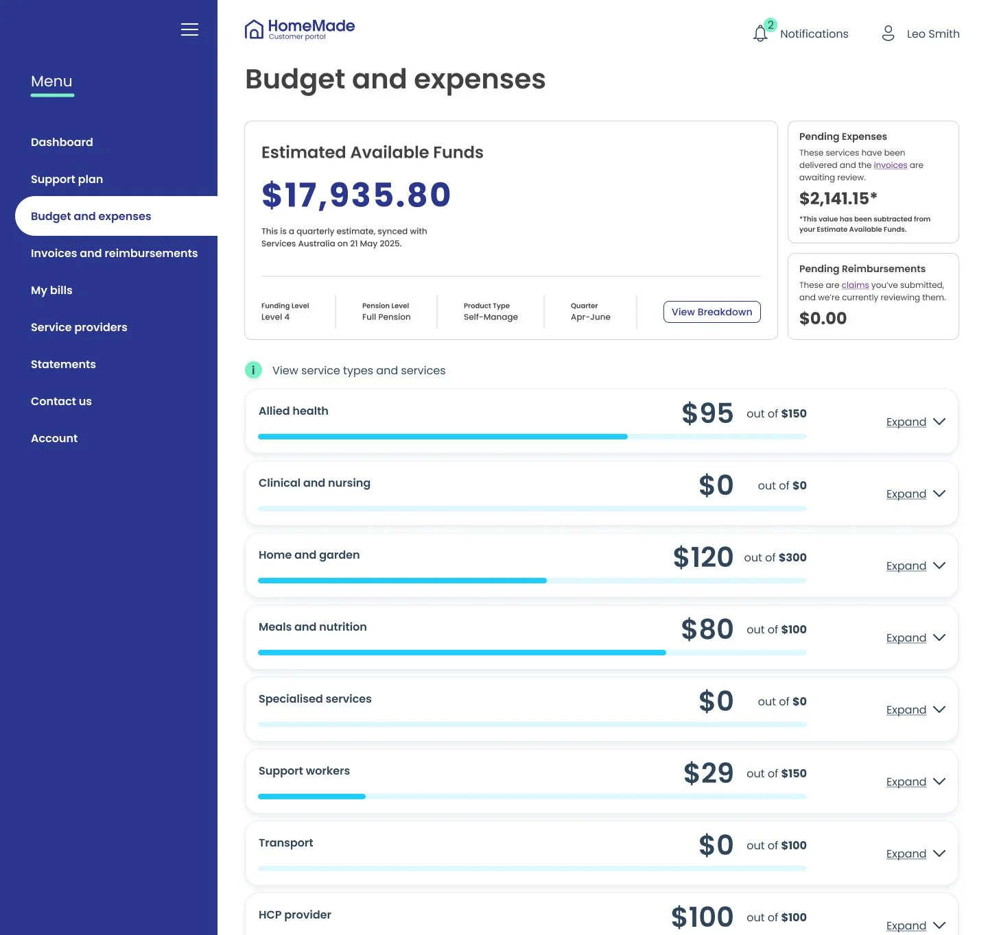
The Financial Summary shipped across both platforms — but it covered one of the funding streams. The others, plus a legacy pool of unspent funds that behaves differently again, were still ahead of us. I said before launch that the MVP wouldn't be enough on its own, and the plan was to ship what was defensibly valuable, then return once the program stabilised with the thing you can't have at the start: having lived with the problem.
The year spent making the numbers true
The stable period never arrived as planned work. What happened instead is the part of this project I'd most want read, because almost none of it looks like design.
A concept I proposed, and then argued to remove
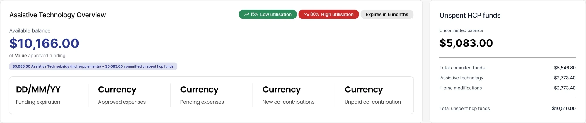
With the remaining funding streams came a harder problem: a legacy pool of unspent funds, shared across streams, with different rules for each. Some streams have to drain it first; another can only touch it once its own funding is exhausted. Working with a senior stakeholder, I proposed a way to model this — identify from the care plan which services needed paying from that pool, and treat that portion as committed. Our PM and engineering lead agreed. We scoped it explicitly to the two streams it was designed for, and my files reflected that scope. We didn't test it, because we never had time to test anything.
Over the Christmas break, while most of the team was away, it was extended to the remaining funding stream as well. I found out at a deskcheck in my first week back, saw tickets already written against it, and raised it immediately. It was too late to reverse. I flagged it as a risk — logic applied to a stream it was never designed for and never reasoned through — and was moved onto other urgent work.
Then the bugs arrived. Because committed amounts could exceed uncommitted ones, the calculation drained the remaining stream's balance. The ledger itself stayed correct, updated separately through the government claims process — but the interface was wrong, and that mattered more than it sounds.
Budget & Expenses isn't only where funding is monitored. When a support partner builds or edits a care plan, they set amounts and frequencies against each action using a calculator powered by this same data. So the flow is circular: B&E feeds the calculator, the calculator sets the care-plan budget, and that budget flows back into B&E as utilisation.
A wrong displayed number therefore doesn't just misinform someone. It can be written into a plan, and that plan becomes the baseline everything downstream is measured against. Which is also why the eventual pivot had a precondition nobody had stated: measuring against the care-plan budget only works if the care-plan budget is sound.
I added basic validations with the engineers as a stopgap. Then our BA ran a full scenario analysis and deskchecked it with me. Working through her scenarios, I kept reaching the same conclusion: each proposed fix introduced a different problem somewhere else. Fixes on this surface take weeks to months, because time-to-fix scales with how deeply a calculation is chained rather than with how bad the bug is. We were spending months to move the error around.
When I was told the business wanted to proceed anyway, I said I'd do it, and asked whether the business was willing to carry the risk. By then two other things were converging: feedback from customers and reps was consistently asking for the balances to be separated, and work the other squad was doing on statements had made the underlying logic look even less defensible. That was the point I concluded the concept I'd helped propose should come out entirely.
Losing the scope argument and winning the foundation one
The BA authored a decision story with four options. The business landed on Option C — splitting the displayed balance into claimed and pending, mirroring an approach that had worked well in statements. That pull was reasonable: statements had genuinely gone well. But it was a good idea imported from a context where it worked into one where it wouldn't.
I designed it far enough to see what it introduced, then pushed back with the simplest version of the argument: we would be showing two balances to customers who already don't trust one. I took that to the BA, she agreed, and she carried it — which on this surface is how design arguments actually travel, because the BA owns the calculation logic and is the person whose word settles what a number means.
I was scheduled to present Option C to the CEO. That presentation was cancelled, because the business pivoted to Option D: removing the committed and uncommitted funds logic entirely and returning the calculations to basics. That was my position, and it shipped in July 2026 — leaving a balance no longer diluted by the legacy fund pool. From the January release to that removal, roughly six months went into a concept that ultimately had to come out.
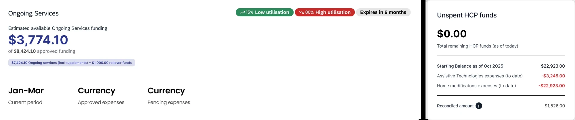
The case for removing it wasn't a principle about foundations, it was the arithmetic. Data and feedback had both landed in the same place: the concept was costing more than it returned — wrong numbers in front of customers and staff, support load, and months of fixes that moved the error rather than closing it.
The sequencing followed from that. If we wanted to solve this properly we needed something stable to build on, and we didn't have one. Strip it back to calculations that are correct, then build the right solution on top of that. It was slower and less popular than layering a new design over the existing logic, and it cost a concept I had co-proposed.
Two things caught before they shipped
A reconciliation change that would have overstated every balance. An engineer on my own team proposed carrying a prior period's balance into the current one — on the account statements draw from. I was at the kickoff and stopped it there: quarters deliberately reset, so carrying a balance forward would have told customers they had more money than they did, on top of the accuracy problems we already had.
A vocabulary collision with the regulator. Reading the government's own program manual, I found the platform had borrowed a regulated term and applied it to something else entirely — the government defines it as funds held for items ordered but not yet delivered. Not a UX problem or a calculation bug, and the strongest single argument for removing the concept rather than redesigning around it.
Three ownership changes, one mental model
None of this is readable without knowing who held the surface. In January 2026 the organisation went from a single product and engineering team to three, and a new squad took the customer portal with a customer-led directive. There was no retro and no formal handover; I gave them my files and research and offered help.
My scope narrowed rather than transferred. I kept the staff platform and the backend the customer portal reads from — and because both render the same underlying data, any change on their side had to be mirrored on mine. My PM asked me to stay across their work for exactly that reason, which is where the calculation audit came from. Meanwhile my own team was running a different workstream with a different goal: not redesigning the customer experience, but correcting calculations that were wrong or still running on the superseded funding model, so staff could do their jobs.
Two directions on one surface. Part of my job became keeping our BA's solutions close enough to the other squad's direction that neither side ended up building something that had to be thrown away. And having held the whole model longest, I moved from designing to being consulted — the decision story meant to settle who owned what ran for a month and closed without a decision.
By mid-2026 both owners of the customer-portal side had left, and the calculation audit stalled with them. The surface came back to me — not through a handover, but because the people holding it were gone. That is the actual shape of this engagement: the model kept returning to the person who never stopped holding it.
Measuring something we actually control
By then the research had returned the same finding from several directions. The display was never the problem. So the question changed: not how do we show this better, but what can we measure honestly. The answer was the customer's own care-plan budget — a number the business sets directly and knows exactly, today, with no government round-trip.
Support partners deliberately budget a customer to roughly 90% of their available funding. That 10% gap isn't slack in the planning — it's a designed buffer, there to absorb a rate that came in higher than quoted, or one extra service in a difficult week.
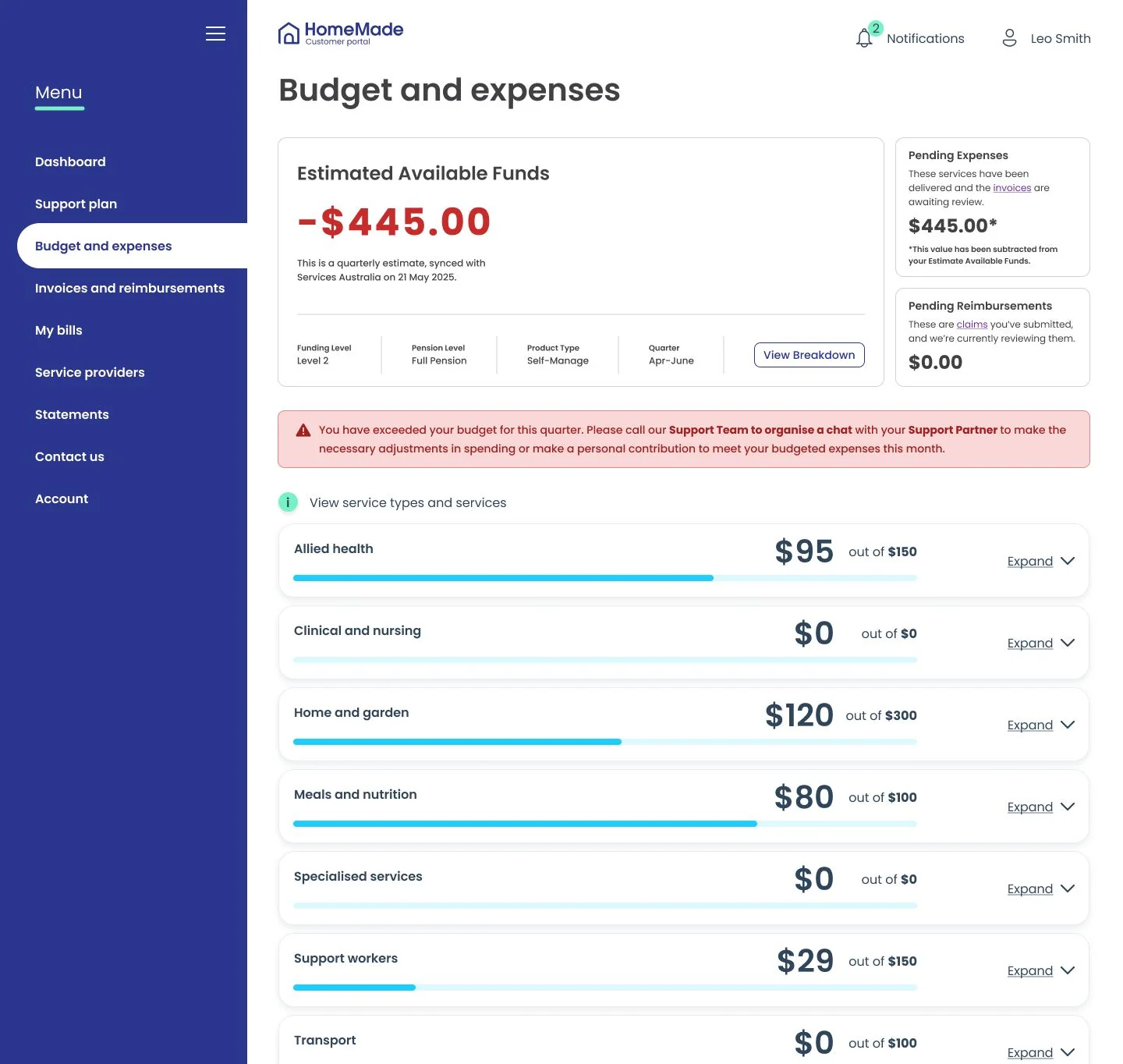
Which means the two numbers fail at different times. An overspend against budget is catchable while there's still funding to cover it. An overspend against funding is already a problem by the time it's visible. Measuring against the care plan doesn't just sidestep the accuracy problem — it buys back a warning window that measuring against funding structurally cannot.
That rule was load-bearing for the whole pivot and had never been written down anywhere. I documented it in August 2026, a year after first working with it.
The idea wasn't new by then either. In September 2025, while the first slice was still settling, I onboarded our BA onto the assistive-technology and home-modification budgets and set the approach: use the care plans as the source for displaying the budget breakdown, because the number of services made a flat breakdown unusable. That's the earliest instance of care-plan-as-budget-source in this work, and it's what the current build rests on. It took about a year to become scheduled work.
Leading the current phase, and the research that scoped it
When the overspend initiative landed I was briefed by a new PM with a tight deadline and a delivery plan already drawn. In four days I pulled together everything prior — my own research, recent feedback, the other squad's work — interviewed a support-partner team lead who had become the operational SME, and pulled fresh call transcripts.
That became a discovery drawing on eight source types, producing seven themes each carrying an explicit confidence rating, plus twelve hypotheses typed and rated separately from the findings. Rating them apart mattered more than it sounds: it let me write "suspected, needs a verified example" instead of overclaiming, which is what made the research credible to engineering rather than something to argue with. It also named two causes as sitting outside design's reach entirely — a structural mismatch between what a customer needed and what their funding was ever going to cover, and an internal delay actioning a request the customer had already made, with cost accruing throughout. Saying so changed the scope conversation rather than quietly absorbing both into a design brief.
I then cross-checked the pace logic against the operational procedure and with a real support partner before calling any of it confirmed — the difference between a design that's been reviewed and one that's been verified.
The finding that revised my own earlier principle
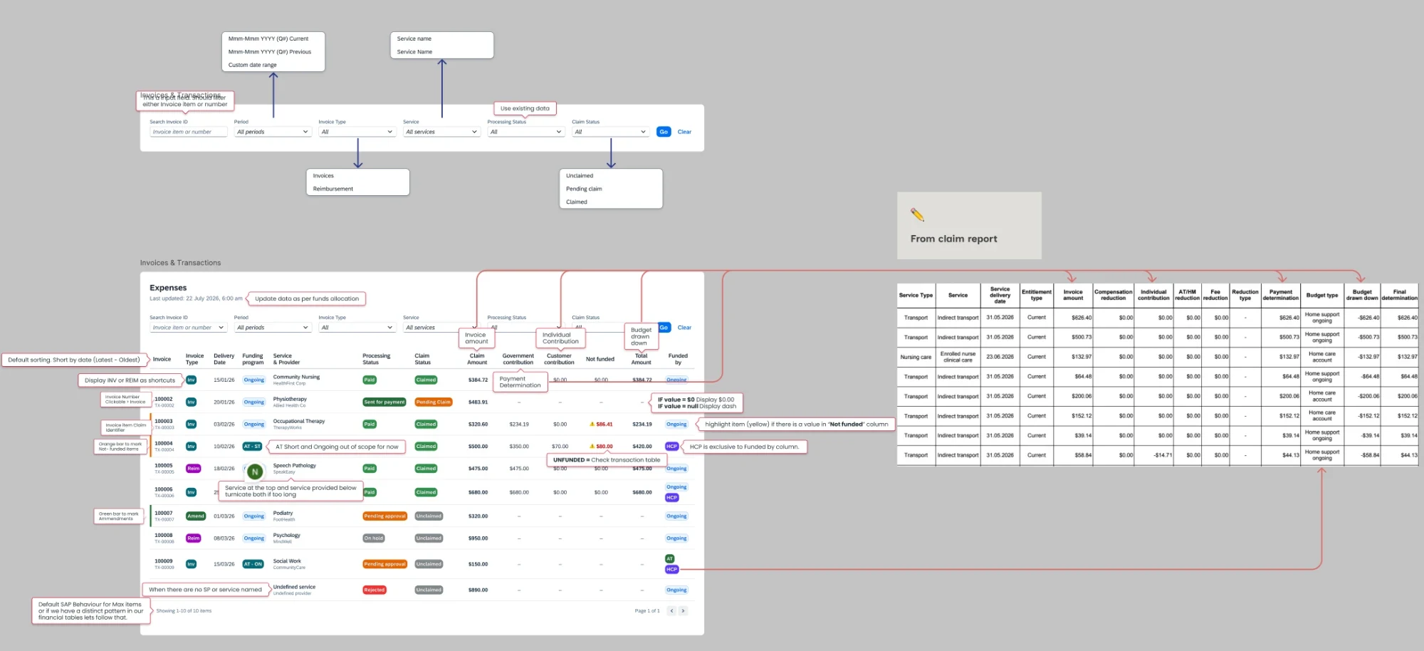
Three independent sources converged on something that cut against the direction I'd set in 2025: people didn't want a dashboard, they wanted a ledger. A staff-side reviewer, a customer describing their own reconciling process, and a designer with no domain context who proposed a plain transaction model cold all arrived there separately.
The customer evidence was the sharpest on record. Invoices were being grouped into single summary rows, so a line labelled with one service category could contain several different services delivered on different days. Line items carried no dates, and there was a lag of weeks between a service being delivered and appearing at all. Verifying a single charge meant working down through several screens to a downloadable document — and then, for someone with ageing eyesight, reading it with a magnifying glass.
Progressive disclosure from a summary — my own second principle — is genuinely right for comprehension. It is not what people need in order to reconcile. Reconciling requires a dated, itemised, provider-named ledger, and the page as designed served neither job completely. That's the correction I'd make to my 2025 work: I had treated understanding and verifying as the same need. They aren't — and it's exactly why customers were cross-checking three documents.
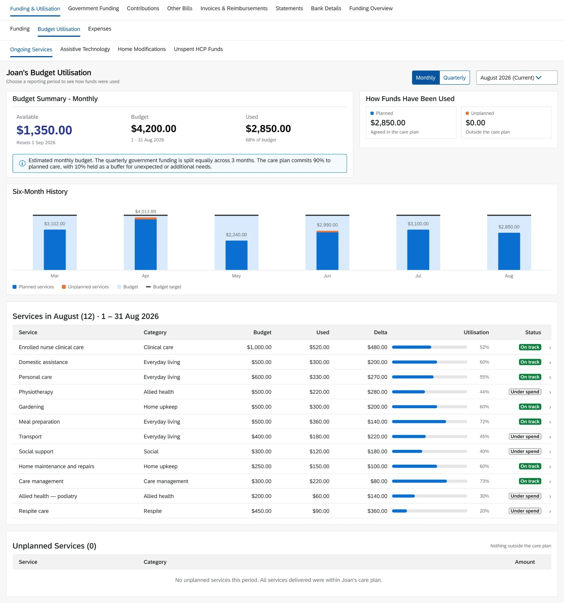
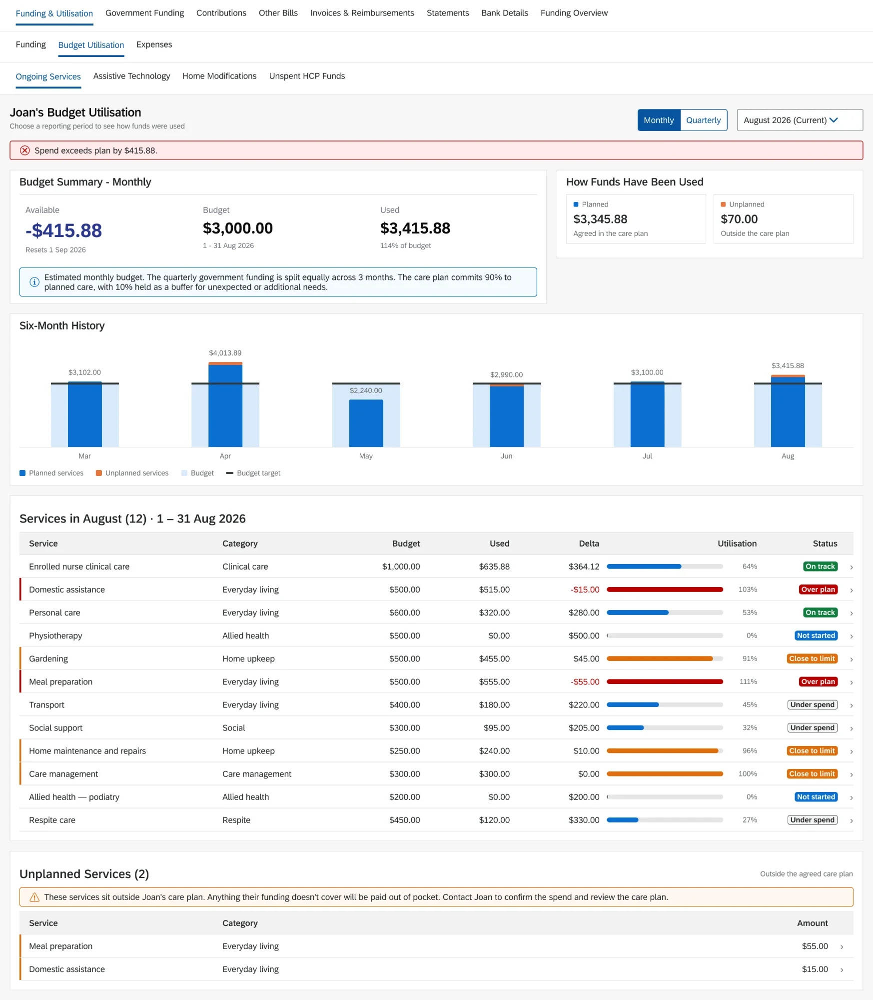
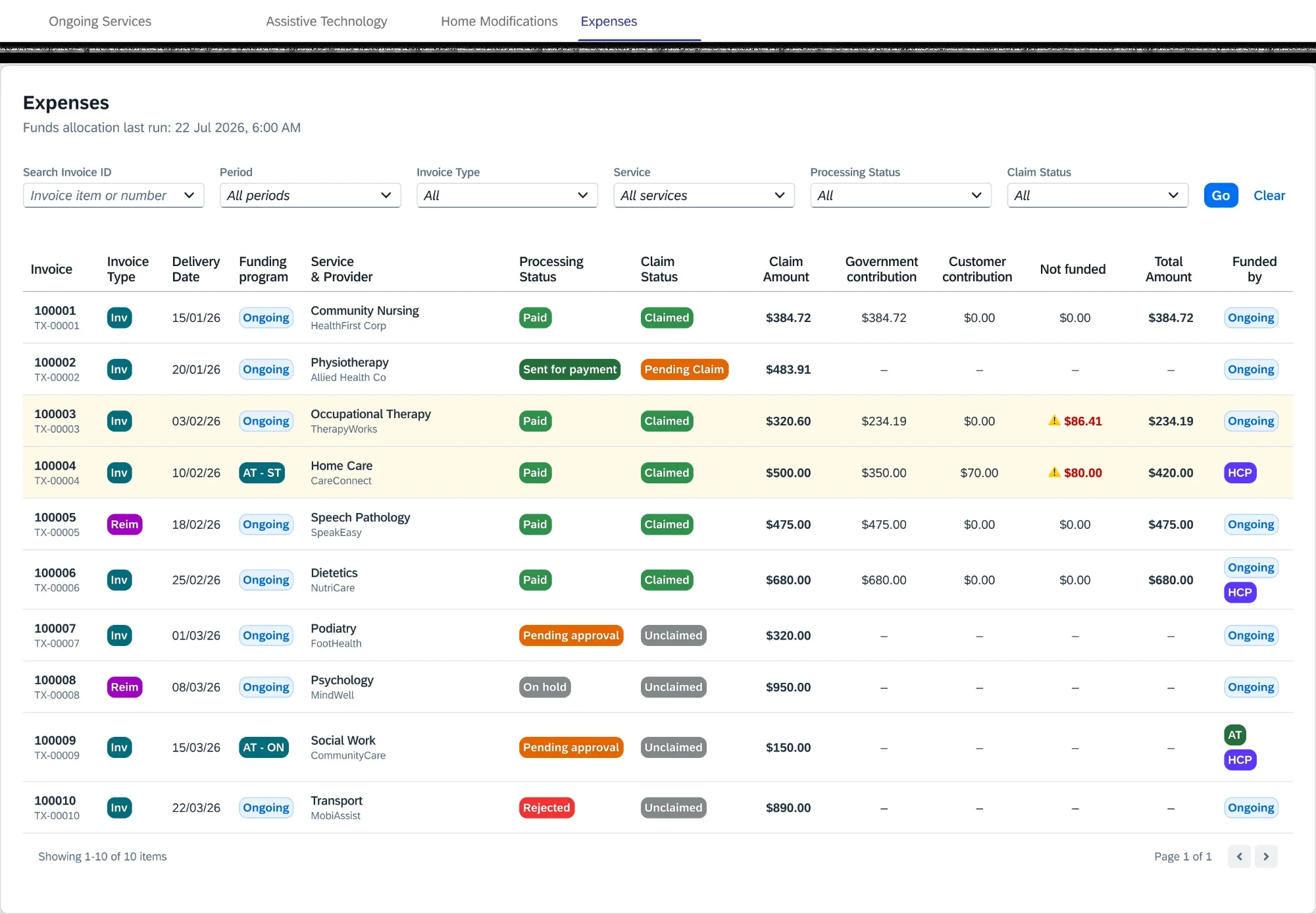
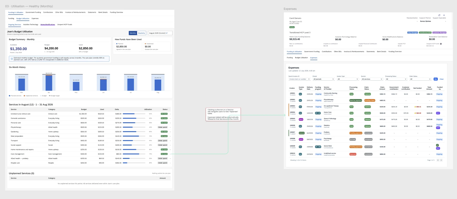
Two things came out of the shift. A consolidated Expenses ledger, replacing the several separate tools support staff had been piecing invoices together from — I designed the staff version, and the customer-portal release was built from it and adapted to be more customer-facing by the designer who now leads that side. And a Utilisation view built around the care-plan budget rather than funding: budget, used, available, plotted against a plan instead of a government figure that couldn't be trusted week to week.
When the platform won't let you say it in colour
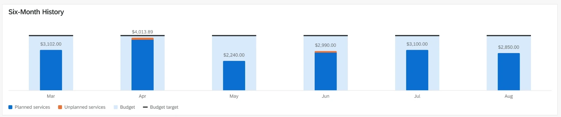
The utilisation chart had one job: make it obvious when someone has gone past their care-plan budget for a period. The intuitive answer is colour — the bar turns red when it crosses the line. The staff platform's charting library can't do that. It assigns colour by category, not by value, so a bar's colour is fixed the moment you decide what it represents. It cannot respond to what the number actually is.
That had been going round in circles for a fortnight, so rather than keep arguing it I ran a feasibility investigation with engineering across the chart types the platform actually offers — what each could and couldn't express, tested against what this chart needed to say. Working through it together we landed on a vertical bullet chart as the best fit, and established in the process that it could do rather more than either of us had assumed: alongside stacking planned against unplanned spend, it can carry a background range showing that period's budget with the target drawn on it.
The compared options set is what settled the debate. Not a stronger opinion — a document showing what each option could do, so the choice stopped being a matter of preference.
The constraint held; the encoding moved
The original limitation never lifted, and the design stopped needing it to. With a background range and a target line per period, the spend bar sits inside a frame — so whether someone is over is read from the bar's height against two fixed reference marks rather than from what colour it is. The comparison moved out of hue and into geometry, which is where the platform could actually support it.
Colour still does one job, and only the job it can legitimately do: unplanned spend — services delivered outside the care plan — is a genuinely separate category, so it earns its own colour. The one thing the platform can encode by hue is the one distinction that isn't a judgement about a value.
One limit stayed, and the copy says so rather than working around it. The baseline is the current care plan, because care plans carry no version history and the budget that applied in a past month can't be reconstructed. So every chart states plainly what the line is and what sitting above it means, instead of implying a period-by-period comparison the data can't support.
Position and extent carry the comparison, colour carries the category, and copy carries the caveat. Less immediate than a bar that turns red — but more precise than colour was ever going to be, and it doesn't fail for anyone with a colour vision deficiency.
The useful part wasn't the chart. It was that a capability disagreement is not actually an argument to be won — it's a question about what the tool can do, and the fastest way through is to go and find out properly, with the person who knows, and write down what you learn.
Building ahead of the ask
A pattern runs through the whole engagement, separate from anything I was assigned: build the working version of an idea before there's a slot for it, put it in front of someone who can act on it, and wait. An account-wide pool for flexible funds; a separate reconciliation page for the legacy pool distorting the ongoing balances; a cost calculator inside care-plan creation so a plan shows its budget impact as it's built. Each was proposed well before it was asked for, and each later reappeared as somebody's funded roadmap item — the last of them now the starting point for the utilisation work.
Overspend visibility is the clearest case: raised with a mockup in May 2025, built as a working alert-severity prototype by that September, and funded as an initiative roughly a year later — by which point a substantial cost had accrued. That's judgement running ahead of the organisation's ability to act on it rather than a failure to push hard enough. It's also not a sustainable way to influence a roadmap: a concept admired in a message thread isn't a concept with an owner and a date.
What didn't hold
Not everything here was a clean win, and I'd rather that stayed visible than got smoothed over.
An early warning for at-risk balances was tested, validated, and shipped — then switched off, for reasons nobody could fully settle a year later. The need it addressed didn't disappear; it just went invisible again until the cost of not having it was real.
The concept I proposed and then argued to remove cost the business roughly six months. I'd defend both decisions — the original reasoning was sound for the streams it was scoped to, and removing it was right once it wasn't — but the honest version is that I helped introduce the problem I later spent half a year arguing to undo.
And after the removal completed, with the surface back with me and no deadline for the first time, I volunteered to run the workshop that would finally reconcile the two directions properly. It still hasn't been scheduled — deferred behind a financial-year kickoff that hasn't happened yet. The most useful thing I could do with the surface is the thing currently waiting on someone else's calendar.
Lessons
- Designing under regulatory uncertainty means designing for the shape of the ambiguity, not the specifics.
- A borrowed pattern is only useful once you've tested whether its underlying assumption holds. A bank balance is a fact; ours wasn't.
- An idea that's correct within its scope becomes dangerous the moment it's applied outside it — and scope written in a design file isn't a control.
- If the foundation is wrong, a better interface on top produces a better-looking wrong answer. That argument is slower and less popular than the alternative, and it was still right.
- Comprehension and verification are different jobs. A summary answers "where do I stand"; only an itemised ledger answers "prove this is right."
- A validated safeguard doesn't stay safe once it's switched off. The need doesn't disappear, it just goes invisible again.
- Advocacy that stays verbal doesn't survive reprioritisation. Something raised and agreed in conversation needs to become an item somebody owns with a date on it.
Two portals, split by initiative rather than cleanly by side, with one shared backend definition underneath so the numbers can't fork again. The Expenses page is live on both. The Utilisation work is in build, with edge cases around partial periods still being settled. Whether recovery or prevention leads the next phase of overspend work hasn't been decided — deliberately, while the team works out which one actually moves the number that matters.
Overspend remains a live problem, and that isn't incidental — it's the evidence for the argument this whole case study rests on. If the foundation had been sound, there would be no overspend problem left to solve. It exists because the calculations underneath were wrong, not because the warnings were badly designed. A better banner on top of a wrong number produces a well-designed wrong number.
That's also the honest limit of what I can claim. The reframe was right and I'd make the same argument again. It hasn't finished being proven, because what it depends on is still being fixed, on a timeline I don't control.