Rebuilding the Founder Dashboard
Founders were losing the thread of their own capital raise — and every internal team had built a workaround for the piece of the product that wasn’t working for them.
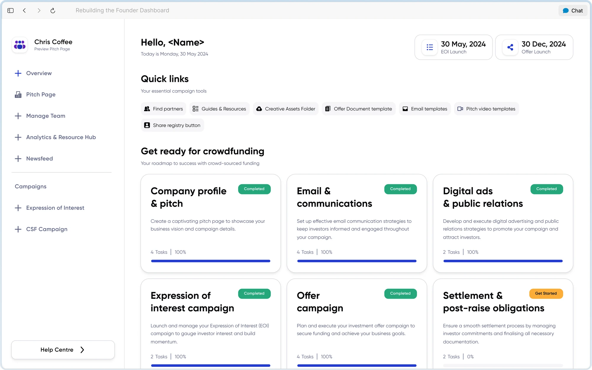
Founders were losing the thread of their own capital raise, and every internal team had built a spreadsheet to work around the dashboard.
Arrived as “the dashboard is confusing”. It was a process-visibility and permissions problem — which changed what got designed, not just how it looked.
Scoped to an MVP after years of unscoped department voting, and put the effort into the Overview page because the whole strategy rested on it.
Handed over development-ready behind a feature flag. I left before the usability test ran, so it is unproven.
Every team had a theory,and a spreadsheet to work around the dashboard.
Founders were losing the thread of their own capital raise, and campaigns were running late. I ran 5 stakeholder workshops and 12 interviews across Campaign Managers, Sales and Legal & Compliance to find out which theories held.
Before
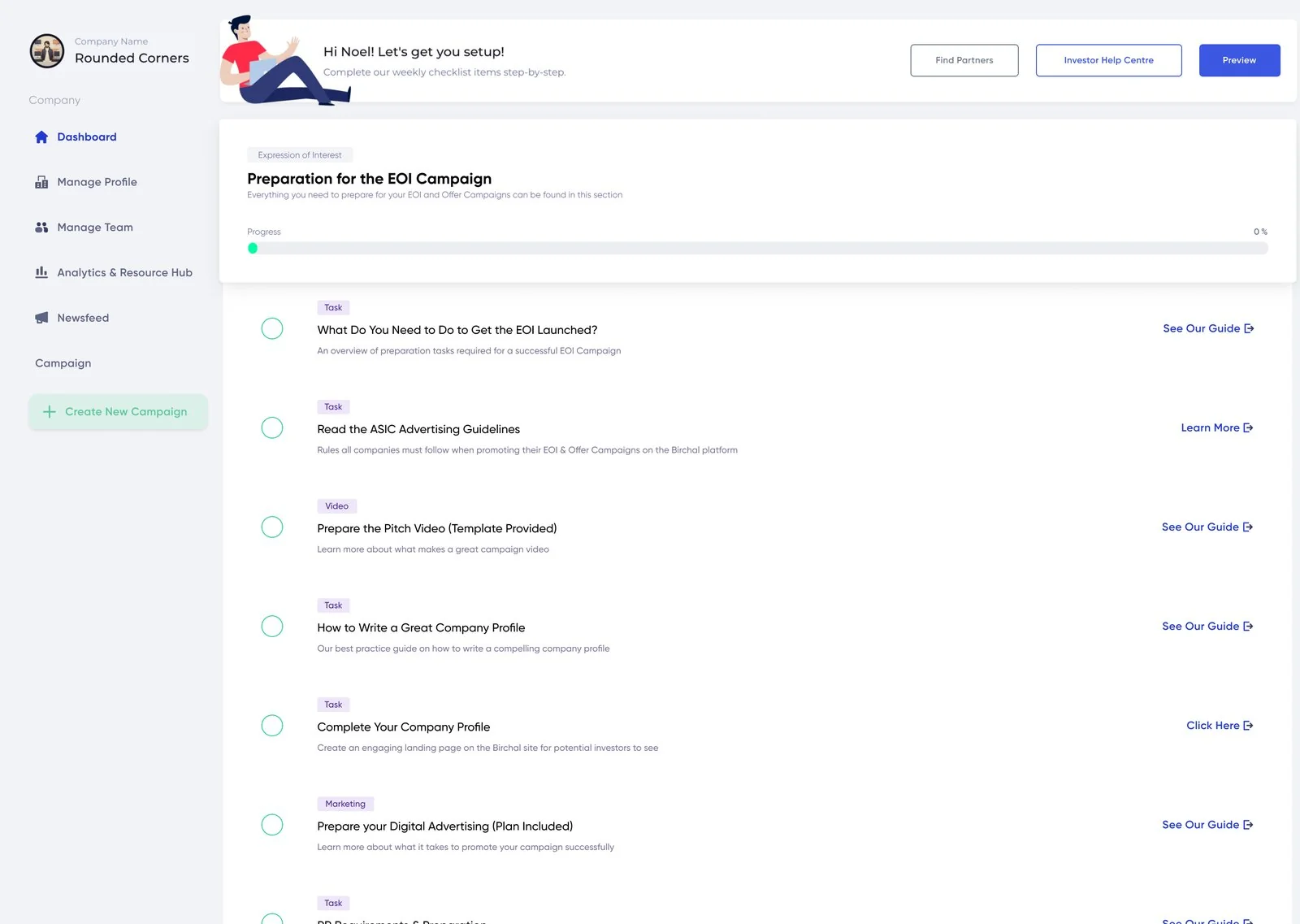
The rebuild had been voted on every week for years without moving. When the contract CTO left, I stepped in as interim squad lead and got a roadmap agreed at shareholder level. That turned the dashboard from a standing item into scoped work with a release date.
It wasn’t navigation.It was wayfinding and permissions.
Nobody was lost in a menu. Founders were stuck in a process that didn’t tell them what came next, then locked out of steps only internal teams could do.
Campaign delays down at least 25%, and less reliance on third-party tools and internal teams. Set before any design work.
Show the raise as stages,not a checklist.
The Overview page got most of the attention, because the whole strategy rested on it. I looked at project management tools and CRMs for the pattern, since the problem was many people on one journey.
Founder dashboard
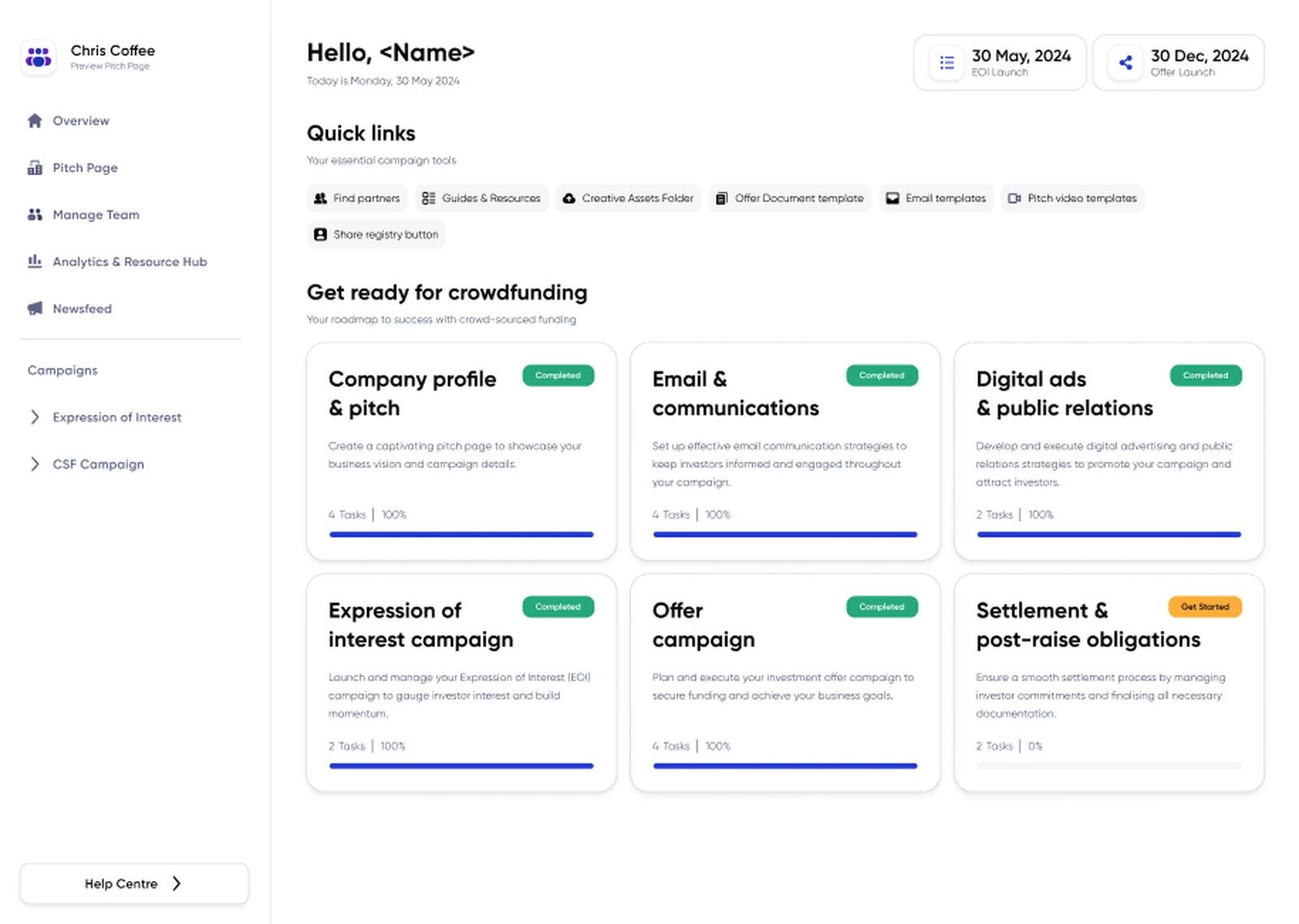
Six stages. One clear journey.
A clear overview gives each stage its own status, then connects founders to the tasks and resources inside it.
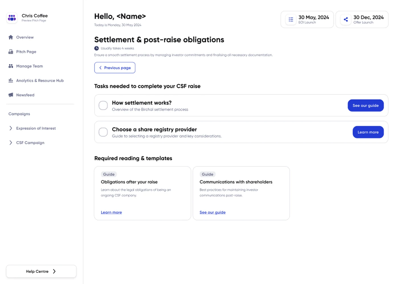
Six named stages, each with its own task count and status, and none gated behind another, because real campaigns don’t run in a straight line. Campaign dates sit top right, and a quick-links block collects the assets founders used to email Campaign Managers for.
Change the information,not the behaviour.
Plenty of founders raise more than once, and they’d already learned the dashboard. Release 1 restructured what it told them without changing how it worked.
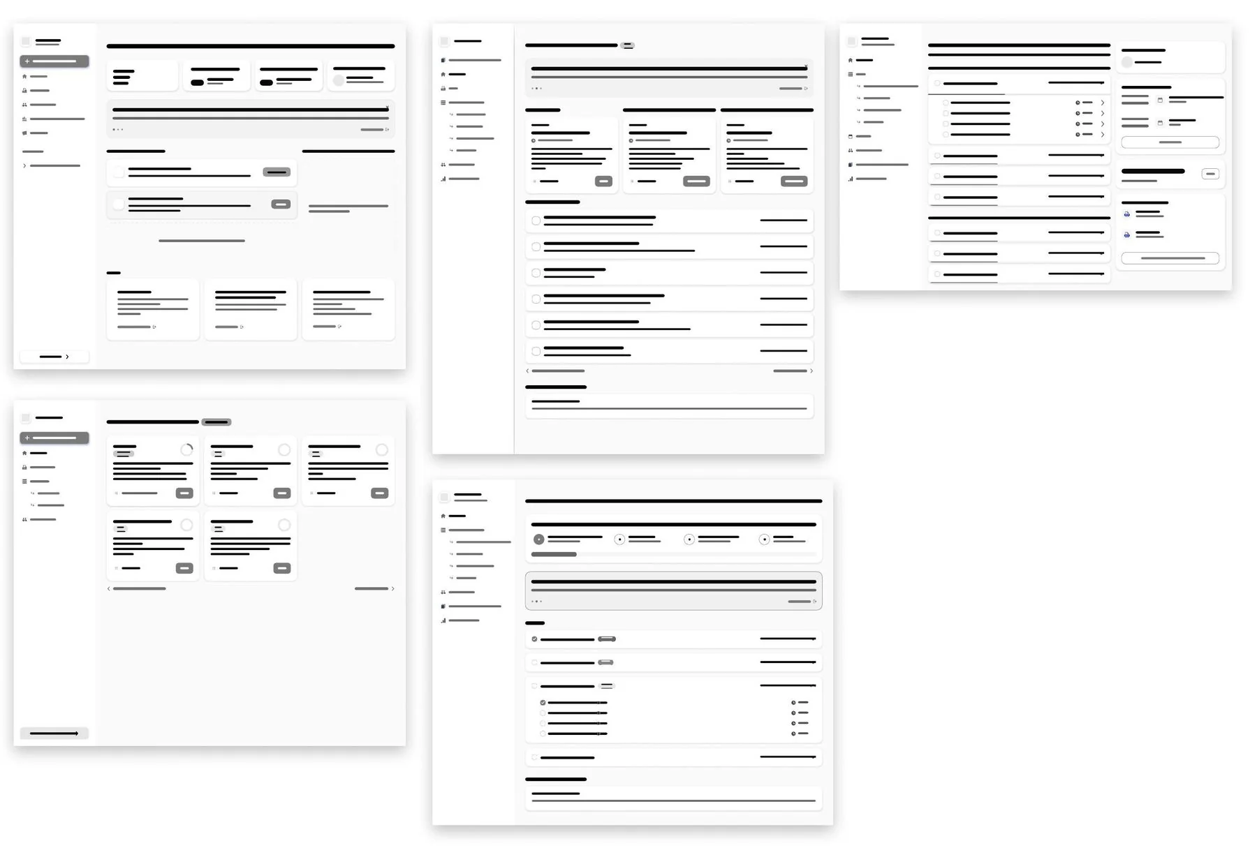
Campaign dashboards
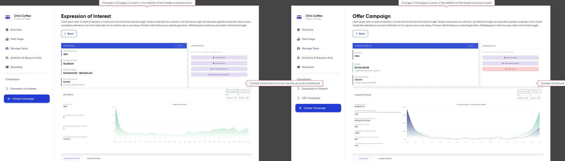
The campaign pages gained a header and a back button. Nothing else changed.
Permissions stayed out of Release 1 on purpose. Who can upload a legal document is a Legal & Compliance decision first, so a founder on Release 1 still waits on someone for those steps.
Handed over,not proven.
The work was development-ready when my role ended: high-fidelity designs, states, accessibility annotations, handover documentation, and the design system to carry later releases.
It rolls out behind a feature flag, to new founders only, so nobody mid-campaign has the dashboard change under them. A comparative usability test was set up in Maze, old against new at the same fidelity, but I left before it ran.
Campaign delays read as days from EOI launch to offer launch, against the twelve months before release. Both dates already sit in the product.
The stated problemis rarely the actual one.
This arrived as “the dashboard is confusing”. It was a process and permissions problem, and that changed what got designed, not just how it looked.
What got it moving wasn’t a design decision. It was scoping an MVP and putting priorities in a roadmap instead of a weekly vote.